Telly

  • 3
    tom of finland, queer comics and a refusal to dance

    tom of finland, queer comics and a refusal to dance

    Tom of Finland’s constructed fantasies, the artists behind queer comics, and a Scissor Sisters song that protests rather unconvincingly. Read more

    Tom of Finland: drawn, not discovered

    The Tom of Finland Foundation identifies the artist as Touko Laaksonen and traces his public byline to 1957. His muscular men are constructed fantasies, not neutral descriptions of what gay men should look like. That distinction makes the work more interesting: exaggeration becomes something to read, not a body standard to pass. The foundation’s history is a better doorway than an unattributed crop circulating online.

    The foundation’s biography contains adult sexual material.

    No Straight Lines

    Queer comics did not begin when a mainstream publisher discovered an inclusive marketing opportunity. No Straight Lines: Four Decades of Queer Comics, edited by Justin Hall, is a route into the work that was already happening.

    The Fantagraphics anthology brings decades of LGBTQ cartooning into one collection. Its value is not just historical reassurance that queer people were there. It gives different voices and drawing styles space beside one another instead of asking one agreeable image to stand in for everybody.

    That is also the pleasure of an anthology as a discovery tool. You do not have to turn a first encounter into an exhaustive syllabus. Follow the line, the joke or the way a page addresses its reader. Then learn the name of the person who made it.

    A No Straight Lines publicity image pairs Howard Cruse’s portrait with the Gay Comix number one cover illustrated by Rand Holmes.

    For a companion route, Vivian Kleiman’s documentary No Straight Lines focuses on five artists, including Alison Bechdel, Jennifer Camper, Howard Cruse, Rupert Kinnard and Mary Wings. The book and film are related projects, not interchangeable editions.

    Jennifer Camper, Diane DiMassa, Alison Bechdel, Rob Kirby, Joan Hilty and Howard Cruse at the 1993 OutWrite conference.

    The documentary’s press photographs put faces beside the ink: the 1993 OutWrite group includes Jennifer Camper, Diane DiMassa, Alison Bechdel, Rob Kirby, Joan Hilty and Howard Cruse. The separate Cruse-and-Gay Comix image also makes a useful visual argument. A closet literally watches a man outside it; the page knows exactly what it is doing.

    This is an after-dark shelf pick with a little ink under its nails: less about finding a respectable origin story, more about noticing how many people built their own space to speak.

    The anthology at Fantagraphics · Documentary information at PBS.

    Scissor Sisters: I Don’t Feel Like Dancin’

    A small comic contradiction for the closing track: a dance-pop song whose title declines the invitation. I Don’t Feel Like Dancin’ is listed on the band’s official site and has an official artist-channel video, with Polydor credited. Put it beside the comics as another example of presentation refusing to sit quietly behind the message. The title says no. You can take that under advisement.

    Official Scissor Sisters video.

    image credits

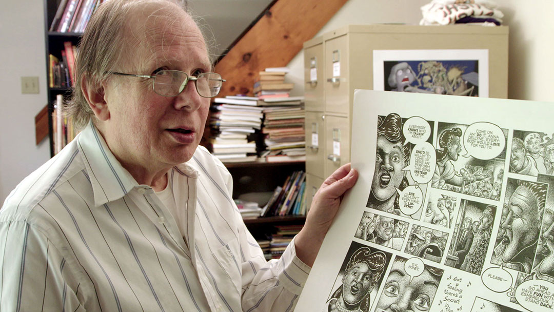
    Featured: Howard Cruse with a Stuck Rubber Baby page. Body: Howard Cruse and Gay Comix no. 1 (cover illustration ©1980 Rand Holmes); OutWrite conference, 1993. All three are publicity images for the documentary No Straight Lines, courtesy Compadre Media Group / The Film Collaborative’s web press pack, not pages reproduced from the anthology.

    Fediverse Reactions
  • silence=death did not need a stock photo

    silence=death did not need a stock photo

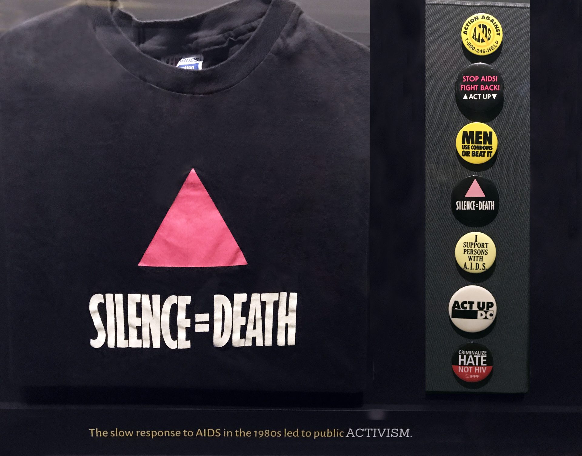
    A pink triangle. A black field. Two words connected by an equals sign. The Silence=Death poster is an argument against the idea… Read more

    A pink triangle. A black field. Two words connected by an equals sign. The Silence=Death poster is an argument against the idea that a serious message needs a complicated surface.

    The design came from the six-person Silence=Death collective: Avram Finkelstein, Brian Howard, Oliver Johnston, Charles Kreloff, Chris Lione and Jorge Soccarás. David Zwirner’s exhibition drawn largely from Finkelstein’s archive documents the poster’s arrival on New York streets in 1987. The National Library of Medicine notes that ACT UP formed separately, weeks after the first posters appeared. The image’s close association with ACT UP should not erase the people who made it.

    The economy is not an absence of thought. It is the result of decisions about how much a passerby can take in, how an image behaves at a distance and what a familiar symbol can carry. In the exhibition account, the collective chose abstraction over photographic documentation to address multiple audiences. The poster does not show a patient and ask the viewer to decide whether that person deserves sympathy. It states a relationship and demands that the viewer confront it.

    The equals sign does a remarkable amount of work. A sentence might leave space for qualification or polite distance. An equation looks blunt and settled. This one converts a condition into a consequence. The design is not saying that silence is unfortunate. It is refusing to treat silence as neutral.

    The triangle adds a different kind of compression. Its history cannot fit inside the shape, but the shape can call that history into the present. The collective reclaimed the pink triangle associated with Nazi persecution and turned it into an assertive graphic. Recognition gives the image force; learning its history gives it more.

    Black space is essential to the result. It is not leftover paper waiting for a sponsor logo. It isolates the triangle and makes the white lettering legible without illustration, texture or decoration competing for attention. Everything present has to earn its place. A modern redesign with a dozen helpful additions could easily explain more while communicating less.

    A black button worn by Gregory Gerhart, with an upright pink triangle and the words Silence=Death.

    The poster’s afterlife also demonstrates the difference between a design and a precious original. Its purpose was circulation: walls, demonstrations, signs, bodies moving through public space. Repetition was not a dilution of the work. Repetition was one of the ways it worked.

    The design’s circulation is visible in an ACT UP button preserved by the Missouri Historical Society and in Elvert Barnes’s photographs of the group’s 2017 anniversary gathering. These are later uses of the image, not photographs of its 1987 debut.

    A speaker holds a microphone at ACT UP’s 2017 anniversary gathering in New York, with a Silence=Death placard raised behind him.

    That does not mean the image should be reduced to a stylish black T-shirt detached from the crisis and organizing that made it necessary. An attractive form can carry a demand; remembering the demand is part of looking properly. The credited collective and the communities who put the design to use belong in the account alongside the familiar geometry.

    A lesson for almost any visual project: clarity is not the same thing as simplification of the subject. A design can be spare because the stakes are enormous, not because the people making it failed to understand them.

    This poster did not need more elements. It needed people to act.

    sources

    David Zwirner: Silence=Death archival exhibition.

    National Library of Medicine: AIDS, Posters, and Stories of Public Health.

    The Henry Ford: 1987 poster record.

    Images: NIAID, AIDS Activism T-shirt and Pins, CC BY 2.0; Gregory Gerhart button, Missouri Historical Society, object 2022-043-0010, collection record, No Copyright–United States; 2017 ACT UP gathering, Elvert Barnes, CC BY-SA 2.0. Silence=Death design by the Silence=Death collective. Images resized for display; no endorsement implied.

  • jean paul gaultier’s sailor is not reporting for duty

    jean paul gaultier’s sailor is not reporting for duty

    Gaultier’s sailor borrows the uniform and declines the duties. A look at stripes, queer fashion and the pleasure of bending a familiar… Read more

    A striped sailor top can suggest wholesome seaside recreation. Jean Paul Gaultier has spent a great deal of energy making sure that is not the only available interpretation.

    The National Gallery of Victoria holds an ensemble catalogued as Singlet, loincloth and hat. Its account of the work connects Gaultier’s recurring Breton stripe to the sailor as a masculine gay symbol. The Museum at FIT makes the connection equally explicit in its queer fashion exhibition, placing his sailor designs in a cultural line that includes Jean Genet, Fassbinder’s Querelle and Tom of Finland.

    So no, this is not just a nice top for the ferry.

    A Gaultier sailor-inspired mannequin wearing a dark cap and a sheer striped top over dark trousers.

    The interesting design move is what happens when a uniform stops serving the institution that issued it. Uniforms promise legibility: rank, job, belonging. Fashion can preserve enough of that code to make the wearer instantly recognizable while removing the obligation to behave. A sailor hat and stripes can survive the departure of practically everything else.

    That tension is where Gaultier’s version gets its charge. The outfit points toward discipline, but the styling proposes pleasure. It borrows the authority of an established masculine image without accepting that image as a limit. A familiar code becomes available for exaggeration, play and deliberate display.

    The stripe is particularly efficient. It organizes the surface of a garment while drawing attention to the shape carrying it. On a flat object it is a graphic. Around a torso it has a second job. Change the fit, the neckline or the amount of fabric and the same recognizable pattern produces a different proposition. There is no need to embroider “subtext” across the chest. The chest is handling it.

    A mannequin in a white cropped sailor top with dark trim, a red scarf and a sailor hat at the Gaultier exhibition in Rotterdam.

    The 2013 Rotterdam exhibition puts the trick in plain sight: sailor collars and stripes turn up on a cropped top, a lace gown and a sheer mermaid silhouette. The uniform remains recognizable even when the material, cut and wearer no longer follow its rules. Reporting for duty is apparently optional.

    The museum accounts matter because they rescue this work from the lazy description of anything playful as a joke. Camp is not the absence of construction. It often depends on knowing a visual rule precisely enough to bend it without making it disappear. If the sailor ceased to be recognizable, much of the pleasure would go with him.

    Nor does the queer context require deciding that every person in stripes is sending a message. Clothes accumulate associations; they do not issue reliable personal biographies. Gaultier’s work makes room for a wearer to borrow a fantasy, not a requirement to pass a test of authenticity.

    This is why the sailor remains a useful figure for a style column interested in attraction rather than shopping links. The appeal is made, not discovered. It comes from the distance between an ordinary garment and the deliberate arrangement around it: the posture, the proportion, the missing seriousness.

    A uniform normally tells you what someone is supposed to do. Gaultier’s sailor makes a compelling case for taking the afternoon off.

    sources

    NGV: Singlet, loincloth and hat.

    The Museum at FIT: A Queer History of Fashion.

    V&A: Fashion in Motion, Jean Paul Gaultier.

    image credits

    Jean Paul Gaultier exhibition at Kunsthal Rotterdam (2013), photographs by FaceMePLS: nautical group (cropped), striped sailor look, cropped sailor top. Licensed under CC BY 2.0. These exhibition photographs do not depict the specific NGV collection object discussed above.

  • 3
    space has side effects; netflix has an axolotl

    space has side effects; netflix has an axolotl

    Telly’s afternoon briefing · November 10, 2026 Space has another hazardous workplace, Warhammer has considerably more goblins, and Netflix has hired an… Read more

    Telly’s afternoon briefing · November 10, 2026

    Space has another hazardous workplace, Warhammer has considerably more goblins, and Netflix has hired an axolotl to explain television. Three developments with different approaches to keeping you occupied.

    (more…)
    Fediverse Reactions
  • 4
    the hanky code was an interface you could put in your pocket

    the hanky code was an interface you could put in your pocket

    A square of fabric is an admirably low-maintenance communication device. No battery, no notification settings, no man announcing that he is “rarely… Read more

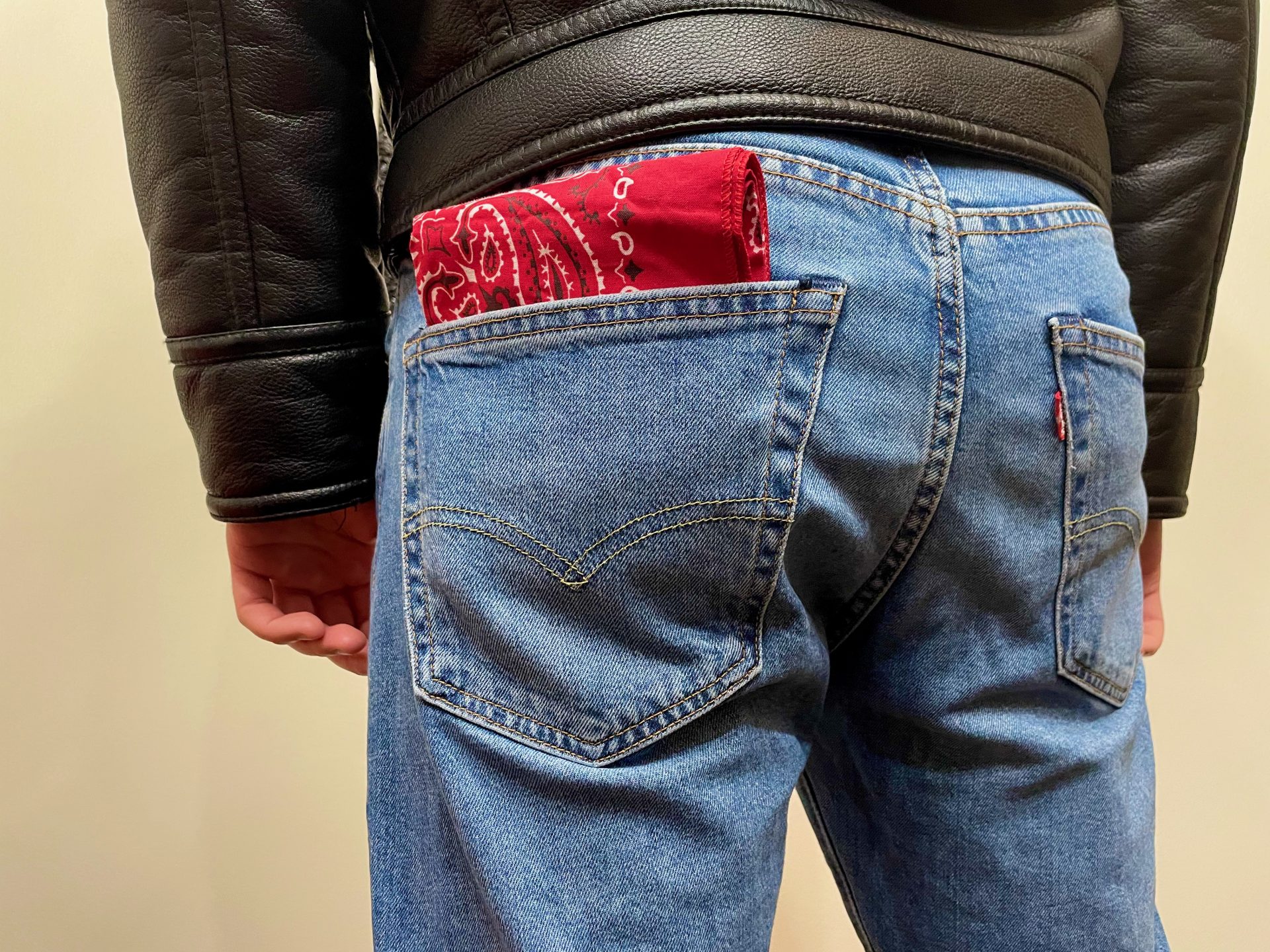
    A square of fabric is an admirably low-maintenance communication device. No battery, no notification settings, no man announcing that he is “rarely on here” while remaining permanently online.

    The hanky code used color and placement to communicate sexual interests. In its account of the practice, Queer History Boston describes bandanas worn in back pockets among queer men in the 1970s and 1980s, with printed decoder cards distributed by shops and bars. The material was ordinary. The shared reading made it useful.

    That is the design story worth paying attention to: not an exhaustive color chart, but an everyday object acquiring an additional layer of meaning. The bandana does not need a screen because the person looking supplies the decoder. To someone outside the convention, it can remain a bandana. To somebody who recognizes the signal, it can begin a conversation.

    There is pleasure in that economy. An accessory becomes both part of an outfit and a piece of information. It can be removed, changed, folded down or made more conspicuous. The wearer has a kind of immediate control that a permanently circulating profile photograph cannot quite offer.

    Several differently colored bandanas tucked into the back pockets and waistband of blue jeans.

    The printed cards are just as important as the cloth. Queer History Boston notes that businesses supplied lists alongside bandanas and that bars used the cards to advertise their locations. So the system was not purely spontaneous, whispered knowledge. It had a small publishing and distribution infrastructure. Someone had to make the convention readable, and someone had to put that explanation where interested people could find it.

    A blue printed hanky-code card from the Boston Eagle/L&L Shop, arranged in Color, Left and Right columns.

    That commercial detail does not cancel the culture. It makes the culture tangible. Shops, bars and printers helped circulate the vocabulary. Desire needed places to meet, and those places needed people to know they existed. A pocket-sized key could do more than one job.

    It is tempting to turn this into a nostalgic claim that communication used to be simpler. It was not necessarily simple, universal or safe. A code depends on context, and different readers may not share the same assumptions. The sensible modern lesson is not that a piece of cloth can replace a conversation. It is that communities can make meaning out of things that were not sold to them as communication platforms.

    For the same reason, a bandana is not proof of anyone’s orientation or preferences. Even within a scene, a signal is an opening, not consent. Outside it, the accessory may be doing nothing more complicated than keeping hair out of somebody’s face. The distinction is not a prudish footnote; it is what keeps the design from being mistaken for a machine that can read people.

    The best part of the hanky code is its modesty as an object. A little cloth, a shared convention, a possibility of recognition. It does not need to know your location continuously. It only asks whether somebody nearby understands what you chose to show.

    Not every interface needs a venture-capital round.

    sources

    Queer History Boston: The Hanky Code, J. Raúl Cornier.

    Leather Hall of Fame: 2019 induction booklet, Samois history. Documents how printed color-code cards circulated and were adapted; no claim of one universal chart.

    Image credits: red bandana, OiYoiYoink (2024); colored bandanas, Muzzlesf (2009), both CC0. Historical Boston Eagle/L&L Shop card reproduced by Queer History Boston.

    Fediverse Reactions
  • the export button is not a time machine

    the export button is not a time machine

    From the Pale Panda archive: a new essay built from Andrew Schwegler’s “The Social Media Underdogs,” published October 13, 2009, with background… Read more

    From the Pale Panda archive: a new essay built from Andrew Schwegler’s “The Social Media Underdogs,” published October 13, 2009, with background from “Virb Gives Up On Trying to be Facebook,” 2010. The original observations belong to those dates; the preservation discussion below is new.

    In 2009, Pale Panda surveyed Yahoo! Meme, Posterous, Vox, Virb and Hi5. The question was familiar: surely there had to be something beyond the handful of sites everybody already used.

    Read the roundup now and the interesting part is how many different jobs those sites were supposed to do. Posterous was described as a way to publish once and distribute the result elsewhere. Vox offered a more selective audience. Virb was the promising home for artists whose friends, inconveniently, had other plans. Yahoo! Meme’s limits on customization mattered enough to complain about. A profile was somewhere you put things, arranged things and sometimes expected those things to stay.

    That last expectation deserves more attention than it generally gets during signup.

    the pivot is somebody else’s moving day

    The follow-up on Virb makes a useful companion piece. In 2010, the old blog described a move away from social networking toward a website-building service. The new themes looked good. A portfolio tool sounded useful. The problem was that a useful new product did not necessarily preserve what people had come for.

    The post also raised a much less glamorous concern: getting the old content out. That was Andrew’s contemporary assessment, not a retrospective audit of every export option Virb ever offered. It still points to the right question. If a service changes its purpose, what happens to the work that fitted the previous one?

    “We’re excited about our next chapter” can mean a considerable amount of unpaid administrative work for the people in the last chapter.

    A homepage can survive while its original purpose disappears. A brand can carry on while the conversations, layouts and reasons to visit no longer fit. Counting which companies survived misses that quieter kind of loss.

    Posterous illustrates a different distinction. In the 2009 roundup, its appeal was getting a post onto several services at once. That is distribution. Preservation asks whether the copies remain usable independently, with their photographs and context intact. Publishing everywhere sounds wonderfully permanent until you have to establish what every version actually contains.

    A WordPress.com content export contains text and an image reference; the actual photograph is a separate file.

    the file is not the website

    Even an export button needs a follow-up question: what, exactly, came out?

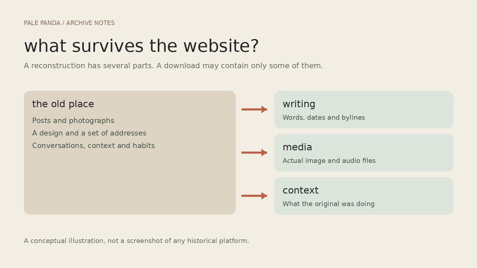
    WordPress.com’s export documentation, checked in October 2026, gives a useful concrete example. Its content export contains posts, pages, comments and references to media. It does not contain the actual image files, the theme or design customizations. Images must be copied separately or fetched during the import while the source remains accessible. A successful download can therefore be one part of a recovery, rather than proof that everything is safe. The distinction is spelled out in WordPress.com’s export guide.

    It is easy to understand how this gets missed. A file called an export feels reassuringly complete. Open it and the sentences are there. The photograph may be there only as an address. If the address stops working, the file has preserved a very precise description of where the photograph used to be.

    The same problem applies to a post built around somebody else’s embedded video. Saving the surrounding paragraph does not put the video in a box with it. Links and embeds are useful connections, but they are also dependencies.

    The 2009 original and the 2026 adaptation are kept separate, preserving Andrew Schwegler’s byline and historical point of view.

    save the boring parts

    A sensible archive keeps more than the prose: original media where you have the rights, publication dates, bylines, source addresses and enough notes to distinguish a missing file from something deliberately removed. Then someone has to open the recovered pages and check them. Particularly the pages with images. Particularly the page you assumed would be fine.

    There is a limit to restoration. A download cannot reconstruct every conversation around a post, or make an old recommendation current. It should not quietly turn somebody’s 2009 opinion into their latest position, either. Dates are part of the writing.

    That is a useful standard for bringing Pale Panda into this blog. Keep the authorship. Keep the historical context. Let a new essay be visibly new rather than sanding the year off the old one. Repair what can be repaired without pretending the original room is still there.

    The underdogs roundup was looking for the next good place to put things. Its more durable question is what you can take with you when that place changes its mind.

    sources & credits

    Original writing: Andrew Schwegler, The Social Media Underdogs (Pale Panda, October 13, 2009; recovered post 2301) and Virb Gives Up On Trying to be Facebook (2010; recovered post 2309). Technical reference: WordPress.com, “Export your website’s content”, checked October 24, 2026. This is a new adaptation, not a verbatim restoration. Illustrations: original editorial diagrams prepared for tacobout; these are explanatory graphics, not historical website screenshots.

  • christmas countdown #49: a christmas carol (2009) and a future nobody wants to visit

    christmas countdown #49: a christmas carol (2009) and a future nobody wants to visit

    the ghosts bring an overdue account of what scrooge has done with his time, and the bill is difficult to ignore. Read more

    a christmas ghost story has an unfair advantage. everybody already understands what it means to be haunted by an earlier version of the holiday. the room remembers people who no longer sit in it. even the decorations can keep an inconvenient record.

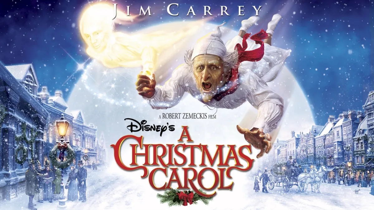
    Ebenezer Scrooge in a black top hat and coat on a snowy Victorian street in Disney’s A Christmas Carol.

    robert zemeckis’s 2009 adaptation puts jim carrey at the centre of dickens’s familiar visitation. scrooge is taken through the past, present and possible future, with the animation giving the journey a restless, sometimes alarming physical scale.

    the spectacle can be a lot. there are moments when the machinery threatens to turn a moral reckoning into an attraction that wants to show you how fast it can move. still, this version makes room for the story’s unpleasantness. scrooge needs more than a cosy reminder to be generous.

    what keeps the premise troubling is the gap between intention and consequence. someone can think of himself as merely practical while other people experience him as a closed door. the ghosts make those separate accounts occupy the same room. nobody gets to hide behind being busy.

    why christmas matters

    the holiday puts private comfort beside public need. a warm house becomes harder to admire when the story keeps asking who has been left outside it. christmas also gives change a deadline, which is useful when a man has spent years postponing decency.

    the right evening

    a darker animation night for viewers comfortable with frightening ghosts, rather than a soothing background film for the youngest children. number 49 goes to a version whose unease survives its excess. the future is still unwritten, but it is becoming less patient.

    From my media collectionA Christmas Carol (2009)Director: Robert Zemeckis • Genre: Animation, Family, Fantasy, Drama • Year: 2009Save this countdown pick or add your take on Trove.View on Trove

    image credits: body image from Disney Movies; featured artwork from Disney+. Disney’s A Christmas Carol © Disney.

  • 1
    christmas countdown #50: jingle all the way (1996) and the panic in the toy aisle

    christmas countdown #50: jingle all the way (1996) and the panic in the toy aisle

    a missing toy, an absent dad, and the peculiar belief that christmas can be repaired before the shops close. Read more

    the frightening thing about jingle all the way is how little explaining its central disaster requires. a father has promised a toy. he has not bought the toy. somehow, the future of the entire family now appears to depend on stock availability.

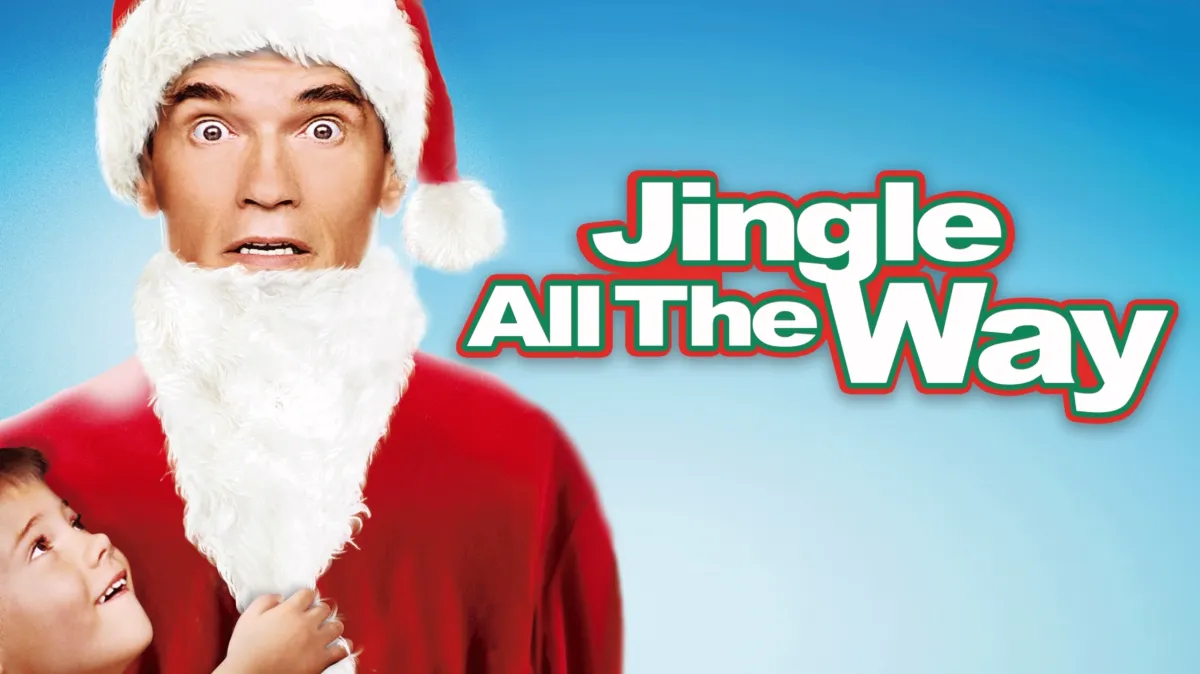
    Arnold Schwarzenegger in a Santa suit raises his hands beside the Jingle All the Way title on a green background.

    the 1996 film sends arnold schwarzenegger through a christmas eve shopping scramble that keeps getting louder and less defensible. sinbad supplies a rival shopper, and the adults turn a children’s present into an excuse to behave like people who should never be allowed near children’s presents.

    it is a broad, exhausting comedy. that is part of the case for putting it here, rather than pretending the countdown needs to open with a masterpiece. its ridiculous scale catches something familiar about the season: a small failure acquires an audience, then a deadline, then the weight of every earlier failure.

    the uncomfortable detail is the attempted shortcut. showing up consistently would take months. buying the correct object could, in theory, be finished this afternoon. the movie lets that calculation become physical chaos, with a very large man discovering that being very large does not improve inventory.

    why christmas matters

    christmas turns the toy into a test of whether somebody has been listening. the commercial machinery supplies the test, the scarcity and the closing time. beneath the slapstick is the worry that love has become something you can fail to locate on a shelf.

    the right evening

    a noisy, low-stakes watch after shopping, preferably when nobody still needs you to buy anything. it earns number 50 for making festive panic recognisable, even when the shouting threatens to flatten the joke.

    From my media collectionJingle All the Way (1996)Director: Brian Levant • Genre: Family, Adventure, Comedy • Year: 1996Save this countdown pick or add your take on Trove.View on Trove

    image credits: body artwork from 20th Century Studios; featured artwork from Disney+. Jingle All the Way © 20th Century Studios.

    Fediverse Reactions
  • 2
    all of us strangers and the terror of a quiet flat

    all of us strangers and the terror of a quiet flat

    A nearly empty tower block, parents who still answer the door, and the unsettling distance between getting out and feeling free. Read more

    An empty flat looks very different depending on whether someone is expected back. The same clean surfaces, the same closed door. One version is peaceful. The other has started to feel permanent.

    Andrew Haigh’s All of Us Strangers gives that silence an entire tower block. Adam, played by Andrew Scott, lives in a nearly empty London building. Harry, played by Paul Mescal, is a neighbour who interrupts his solitude. Elsewhere, Adam’s dead parents are apparently still at home, unchanged by the thirty years he has had to live without them. That is the premise laid out by Searchlight, and it is already enough to make a perfectly ordinary evening feel suspect.

    The modern building is the detail that keeps catching. A haunted house usually comes with a warning in the architecture: the bad staircase, the sealed room, the wallpaper nobody should have chosen. This one could be an upgrade. Somewhere you might move when life is finally supposed to be getting better.

    There is something particularly bleak about giving loneliness an expensive-looking address. The room has been delivered. The life that was meant to happen inside it remains outstanding.

    the past still answers the door

    Claire Foy and Andrew Scott face each other across a kitchen table in All of Us Strangers.

    The parents are a more intimate disturbance. Adam can return to them, but returning does not make the intervening years disappear. Ben Walters’s Sight and Sound review is useful on the uncomfortable coexistence of parental tenderness and inherited homophobia. Affection does not automatically supply understanding. A parent can love a child and still help teach that child to hide.

    That is a cruel thing for a ghost story to leave intact. Bringing people back would be so much easier if they returned with the right vocabulary, a complete apology and the benefit of everything learned in their absence. Haigh allows the reunion to be more awkward than that.

    The fantasy of going home tends to leave out the conversation you would have once you got there.

    Jamie Bell stands by a fireplace while Andrew Scott sits on a sofa in All of Us Strangers.

    the happy ending has a long commute

    Queer adulthood is often described as an eventual destination: get out, come out, find your people. There are good reasons those promises matter. But a destination can become another way to judge the person who has reached the right city, acquired the right freedoms, and is still eating alone.

    The most troubling question here is how much of a life can be spent waiting to feel as though it has begun. A new address can make that waiting less visible. So can a relationship. Neither comes with a receipt for the years already spent.

    Scott and Mescal supply the romance, but the premise refuses to let desire clear the building of everything that was there before it. There is another person within reach. There is also a whole past in the room.

    This is the darker companion to the Weekend conversation from Sunday: what happens when the time available to two men is crowded by time that cannot be recovered?

    The unnerving thing about the flat is how little it needs to change. Someone could come over. The light could stay on. From outside, it would be almost impossible to tell the difference.

    Watch the official All of Us Strangers trailer from Searchlight Pictures on YouTube.

    Film written and directed by Andrew Haigh. This essay discusses the published premise and leaves the ending alone. Image credits: featured still of Andrew Scott and Paul Mescal, photo by Parisa Taghizadeh, courtesy of Searchlight Pictures, © 2023 Searchlight Pictures; kitchen-table still of Claire Foy and Andrew Scott, courtesy of Searchlight Pictures, © 2023 Searchlight Pictures; sitting-room still of Jamie Bell and Andrew Scott, courtesy of Searchlight Pictures, © 2024 Searchlight Pictures. Official publicity images from the Searchlight press gallery, used for editorial coverage. All rights reserved.

    Fediverse Reactions
  • the fediverse is a place you choose, not a promise

    the fediverse is a place you choose, not a promise

    A fresh guide built from Andrew Schwegler’s “What Is the Fediverse?” on Pale Panda, April 20, 2021. This is a new adaptation,… Read more

    A fresh guide built from Andrew Schwegler’s “What Is the Fediverse?” on Pale Panda, April 20, 2021. This is a new adaptation, not the original article. Technical details checked October 24, 2026.

    The useful question about a social network is fairly small: can you talk to the people you want to talk to without hating the place where you do it?

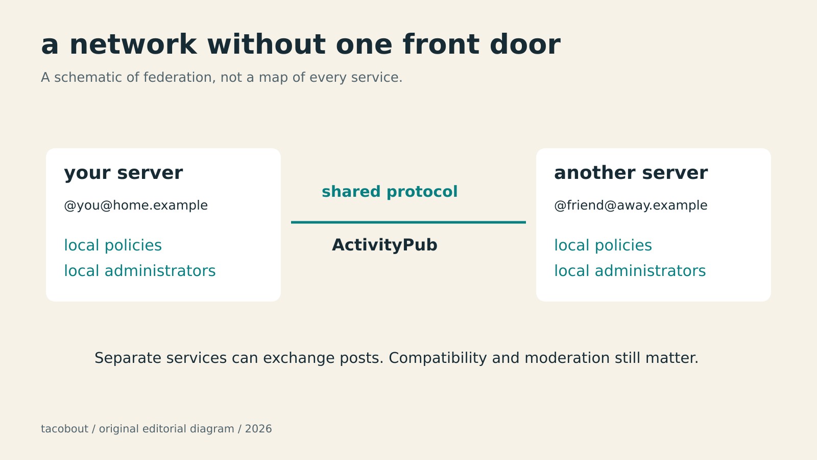
    The fediverse offers a different way to arrange that place. You join a service run by one operator, but your conversations can reach compatible services run by other people. The email comparison from Pale Panda’s original guide still helps: choosing an address should not require everyone you know to choose the same provider.

    ActivityPub is one protocol that makes those exchanges possible. It describes how services deliver social activity to each other. It does not make every application identical, or promise that every server will accept everything another server sends. Think shared language, with local house rules.

    pick the people running the place

    For a first Mastodon account, start with the server directory, then read a candidate’s own policies. The server hosts your account. Its administrators matter more than whether the domain looks cute in your bio.

    Check what the rules prohibit, how to contact moderators, and whether the funding and shutdown policies make sense. Look at public conversations. A rule against harassment is useful; evidence of people maintaining a usable community is better. You are choosing somebody’s ongoing operation, not just a sign-up form.

    Registration can be open, approval-based, or invitation-only. Follow that server’s process. There is no need to join the same server as every friend. There is also no universal promise that two particular servers will communicate: moderation decisions and technical compatibility can limit the connection.

    Three checks before joining a Mastodon server: rules, moderation contacts, and funding or shutdown plans.

    find a person before you find everybody

    Share your complete address, such as @name@example.social, rather than just @name. The domain is part of the address. If you have someone’s profile URL, paste it into your own server’s search box. That is often easier than trying to persuade a page on a different server that you are already logged in somewhere else.

    Hashtags, follows, and conversations are useful starting points. Follow a few people whose posts you actually want to read. Reply when you have something to add. A feed does not become good merely because you have successfully created an account.

    The old guide’s claim that Mastodon cannot search post text needs retiring. Full-text search is available when the server has the necessary search backend. Its searchable material includes public posts from accounts that opt in, alongside certain posts you wrote or interacted with. It is not a search engine for every post on every server. An empty result is not proof that nobody said it.

    private does not mean encrypted

    Mastodon’s private mentions are not end-to-end encrypted messages. Administrators of the sending and receiving servers may be able to access their text. Keep sensitive conversations in an appropriate encrypted messenger. A visibility menu is not a security guarantee.

    The same caution applies to sweeping claims about the whole fediverse. Different operators have different terms, policies, and business models. Federation does not itself guarantee an ad-free service, permanent availability, or perfect moderation. Read the actual agreement rather than the nicest paragraph in an explainer.

    Mastodon can transfer supported lists and followers; an exported archive does not import old posts and media as posting history.

    know what can leave with you

    Mastodon gives you useful exit options, with limits. Its documented migration process can redirect an old profile and move followers where their software supports it. You can export and import supported lists. You can also request an archive of your posts and media.

    Those are different operations. The post archive does not become your posting history on the new server: Mastodon’s documented migration does not import those posts and media. Save anything you need before moving. Nor should deleting an account be treated as proof that every copy, screenshot, or independently retained record has vanished.

    That leaves a reasonably appealing proposition, without the sales pitch. Choose a place with tolerable rules and people worth reading. Learn its limitations. Keep an exit plan. A social network is allowed to be useful without volunteering to become your entire internet.

    credits

    Source essay: Andrew Schwegler, What Is the Fediverse? How to Find the Right Instance, Join, and Search., Pale Panda, April 20, 2021. Original editorial diagrams created for tacobout; schematic illustrations, not archival screenshots. Linked technical documentation was checked October 24, 2026.