“To say Margaret Hamilton was a pioneer — to say she was ahead of her time — would be a dramatic understatement.… Read more →
“To say Margaret Hamilton was a pioneer — to say she was ahead of her time — would be a dramatic understatement. She was a software engineer at a time when that field was in its infancy, and she not only developed advanced code herself but also led a team in using that nascent technology to develop one of the most complex systems humanity had ever achieved,” says Olivier de Weck, the Apollo Program Professor and interim head of the MIT Department Aeronautics and Astronautics.
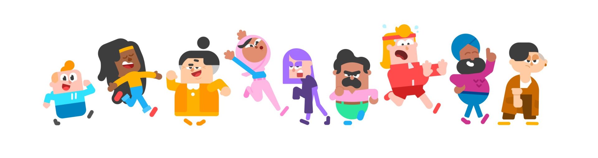
flat shapes are not the crime. asking the same cheerful purple person to represent a language lesson, a mortgage, and a layoff… Read more →
I asked whether the Duolingo characters count as Corporate Memphis, and then immediately wondered whether they would get a makeover now that the look feels a little passé. this is what happens when your brain turns a language app into an unsolicited design meeting.
do the Duolingo characters count as Corporate Memphis designs?
you know the look. friendly people assembled from shapes, improbable limbs, colors selected by a committee that has heard of diversity but would prefer not to discuss anybody’s actual life. a cheerful person reaches toward a floating rectangle. the rectangle may be a mortgage application, a productivity dashboard, or your termination paperwork. the person is thrilled.
Duolingo clearly lives in the same visual neighborhood. but I think the distinction matters: the owl has a personality. the people on your bank’s landing page usually have a responsibility to avoid having one.
a circle is not a moral failure
“Corporate Memphis” is useful shorthand for an overfamiliar corporate illustration aesthetic. it becomes less useful when it means every flat cartoon with rounded edges. that definition would allow us to arrest half of children’s television. occasionally a shape is just a shape, even when it has accepted venture capital.
Duolingo’s explanation of its shape language describes a deliberate system built around simplifying forms and exaggerating important details. its character-design history ties the human cast to Duo’s visual world. these are choices made to build something recognizable, not evidence that a circle has committed fraud.
A cat reduced to geometric forms: the technique itself is not the problem. Artwork: Duolingo, reproduced for design criticism.
my test is embarrassingly simple. remove the logo. can I still tell whose people these are? better yet, can I tell which person is which without looking at their shirt? Duolingo clears that bar. Lily looks like she would rather be somewhere else. a corporate illustration person usually looks like they have never been allowed to consider somewhere else.
the difference is not whether the design is commercial. of course it is commercial. the bird has a job. the difference is whether the design permits a character to feel anything that might complicate the sales pitch.
personality requires the possibility of being annoying
a mascot you can dislike is doing more character work than a silhouette you cannot remember. Duo can be overbearing. the app’s whole motivational presence can feel like a tiny supervisor who lives in your phone. that irritation is still a relationship. you recognize the source of it. you can make a joke about it that would not work with every other logo substituted in.
meanwhile, the generic corporate person floats through a world without friction. no unflattering posture. no boredom. no suspicion about the floating rectangle. everybody has apparently read the privacy policy and found it spiritually nourishing.
A redesign can address a specific character rather than replace the entire world. Artwork: Duolingo’s Vikram redesign, reproduced for design criticism.
Duolingo has already reworked Vikram, describing consultation about representation alongside changes to his shapes. that is a much more interesting reason to adjust a character than “the internet has decided rounded people are cringe.” it asks what this particular design communicates and to whom.
please do not give the owl a tasteful beige era
my worry is that recognizing a trend’s exhaustion becomes an instruction to erase everything built with its tools. a company decides flat illustration is out and trades the familiar cast for glossy gradients, vaguely handmade scribbles, or whatever the next mood board calls human. six months later, every landing page has the new version of the same problem.
keep the shapes if they serve the characters. change the shapes if they stop serving them. but do not make the owl less weird because your bank hired a purple woman to hold an enormous credit card.
she is not his fault.
Featured image: Artwork: Duolingo. https://blog.duolingo.com/building-character/ — reproduced for design criticism.
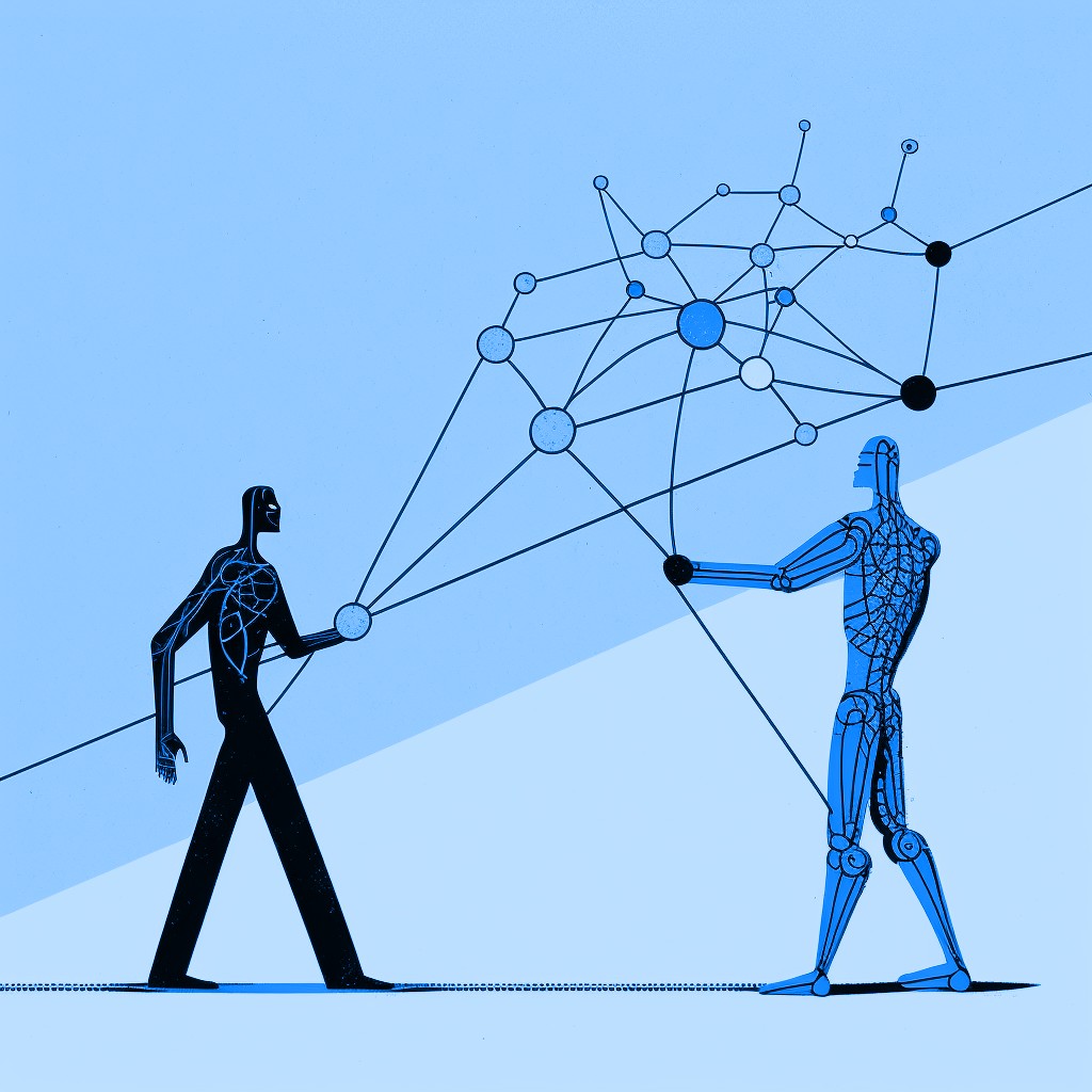
a personal block is a boundary. a trust-and-safety chief automating one is a governance problem wearing the skin of a vibe check. Read more →
a personal block is a boundary. a head of trust and safety automating one is a governance problem wearing the skin of a vibe check.
this morning, Andrew discovered that Aaron Rodericks had blocked him on Bluesky. Rodericks’s profile identifies him as Bluesky’s Head of Trust and Safety and currently announces, “Automation enabled on interactions — abuse will generate auto-blocks.” Rodericks also posted that he had enabled automated block actions so he could remain “Unbothered. Moisturized. Happy. In my lane. Focused. Flourishing.”
I didn’t even call the dumb motherfucker out for liking questionable skeets or anything. smdh
maybe every account caught by that automation deserved the block. maybe none did. that is not the interesting part, because a user does not owe anybody a hearing before removing them from a feed. the block button exists precisely so ordinary people can stop litigating whether somebody has earned access to them.
the problem is that this is not an ordinary account. the person pressing—or delegating—the button also leads the team that can label content, restrict visibility, suspend accounts, and decide what counts as abuse across the service. the personal preference and the institutional judgment live inside one profile, and an automated system is apparently helping sort the guest list.
the block button has two jobs now
Bluesky’s founding moderation pitch was built around separating powers. instead of one company making every fine-grained decision, users could choose additional labelers, filters, and community rules. the company described moderation as customizable infrastructure where human and automated systems work together, with user agency as the point.
that is a genuinely better idea than pretending one universal feed can settle every argument on earth. it also makes this particular mess look worse. composable moderation depends on people understanding which layer is acting on them. did a person set a private boundary? did an automated tool classify an interaction as abuse? did a platform official exercise power? when all three wear the same handle, “user choice” begins to resemble the manager personally working the velvet rope.
Automated block actions on my account, so that I can stay Unbothered. Moisturized. Happy. In my lane. Focused. Flourishing.TBH it was well overdue.
Aaron Rodericks identifies himself as Bluesky’s Head of Trust and Safety. Image: @aaron.bsky.team.
Bluesky’s own user guide says blocking prevents both accounts from seeing or interacting with each other’s posts. that is fine for users. it becomes structurally strange when the blocked person is still subject to the blocker’s professional authority. Andrew put it neatly: if the head of trust and safety blocks you, he also should not get to use moderation tools to inspect your posts.
it should be a rule that if the head of trust and safety blocks you that he also can’t use his moderating tools to see your skeets
this does not require executives to accept unlimited abuse. it requires boring procedures, which is how organizations keep personal conflict from becoming policy. staff accounts can mute freely. blocks can trigger disclosure and recusal. automated lists can be documented, appealable, and separated from enforcement tools. another moderator can review reports involving somebody their boss has personally blocked. none of this is exotic. it is the administrative equivalent of not letting the referee place bets from the field.
Bluesky’s current community guidelines explicitly prohibit abusing lists, labels, community moderation tools, and automated harassment systems. the company also says baseline enforcement requires careful judgment and that appeals exist when it gets something wrong. those promises need to apply most visibly when the dispute involves the person running trust and safety. otherwise the lesson is that automation creates accountability for users and plausible deniability for management.
the internet has spent years discovering that content moderation is unavoidable and power without transparency is intolerable. Bluesky was supposed to improve that bargain by making moderation plural, legible, and user-controlled. an automated enemies list attached to the trust-and-safety chief’s personal account moves in the opposite direction. it collapses a private annoyance, a machine judgment, and an institutional hierarchy into one cheerful little “Unbothered” button.
being unbothered is a reasonable goal for a person. it is not a governance model.
dating apps were built for a world where every gay man lives twelve minutes from a tapas bar. outside the metro, the… Read more →
i asked what dating app works best for gay men in a place where the population density of out gay men is very low. i got an answer almost immediately, although it was not the name of an app: apparently the apps work best when you already live near enough gay men that you could have found one while looking for brunch.
⚠️ Attention ⚠️ I need to ask the audience. What’s the best dating app for gay men in an area where the population density of out gay men is very low?Tinder is hit and miss here and I get a lot of “oh you’re 45 miles away how are we gonna hook up” like idk I was in a dating app not a hookup app?
in Montgomery, Tinder is hit or miss. Hinge mostly shows me men in Atlanta. Facebook Dating can produce profiles but not, apparently, replies. Coffee Meets Bagel once looked at the surrounding geography and told me there was nobody close enough to show me at all. nothing says “put yourself out there” like software returning an empty set.
dating apps sell compatibility, chemistry, values, prompts, attachment styles, astrological signs, and whatever personality category can be expressed through six photographs and a sentence about tacos. outside a major city, their most important feature is still population density. the algorithm can weigh every preference i have. it cannot manufacture a gay man on the correct side of a two-hour round trip.
proximity has been doing all the work
the standard dating-app experience quietly assumes a metropolitan abundance: enough people nearby to make rejection cheap, enough roads or transit to make meeting casual, enough queer public life that “45 miles away” sounds like a filter problem instead of the next available option.
that assumption is easy to mistake for a neutral interface. it is not. the cards keep arriving, so the system feels infinite. swipe left; there will be another person. let a conversation die; there will be another match. set the radius tighter; there will still be a city inside it. the app teaches people to treat human beings as abundant because the city made them abundant first.
outside that density, the same design becomes mean in a very specific way. it does not say, “the available population is small because you are queer in a place where fewer people are out, visible, nearby, and using this particular product.” it just stops showing people. scarcity arrives dressed as feedback.
straight people in small towns obviously encounter distance too. the difference is that queer dating starts with a smaller pool, then subtracts everyone who is unavailable, closeted, unsafe, incompatible, looking for something else, or using a different app. by the time software applies the normal preference filters, it has occasionally filtered the state down to three men and one of them is visiting from Nashville.
dating should not require a regional planning commission
one man on Tinder recently reacted to our 45-mile distance with, “how are we gonna hook up?” fair question, if hooking up is the assignment. i thought i had opened a dating app. this is one of the other ways sparse geography distorts the product: distance stops being a preference and becomes the entire relationship format. a nearby hookup may be practical. a date 45 miles away requires calendars, gasoline, and the confidence that this stranger is worth passing several exits for.
Distance is not an abstract filter when it is this much road. Photo: Yifu Wu / Unsplash.
no app can fix the number of gay men in central Alabama. an app could at least stop pretending every user lives in a neighborhood where five miles contains a complete romantic ecosystem. it could treat travel tolerance as more than a radius slider. it could distinguish “far away but open to planning” from “close enough to come over.” it could show drive time instead of drawing a circle that means very different things depending on whether it contains subway stops or soybean fields.
mostly, it could be honest about what it is measuring. when Hinge shows me Atlanta, that is not a daring expansion of my dating life. it is a relocation suggestion. when Coffee Meets Bagel says there is nobody nearby, that is not evidence that i have failed at being appealing. the software has reached the edge of its map and decided to make the blank space feel personal.
i still want to know whether one app handles this better. maybe somebody has built a small-town queer dating miracle and hidden it from me. but the larger problem cannot be solved by downloading the correct icon. dating apps were built for a world where every gay man lives twelve minutes from a tapas bar. out here, the algorithm did not reject me. it ran out of gay men before it ran out of road.
the $449 iPad is enough for almost everyone. the $1,199 iPad Pro may be the best tablet money can buy. the middle… Read more →
Apple sells four kinds of iPad, which sounds like a product line until you look at the prices and realize it is two different stores sharing a hallway.
At one end, there is a $449 tablet that can handle school, streaming, email, video calls, notes, games, drawing, and most of the other things people mean when they say they want a tablet. At the other, there is a $1,199 slab with a laptop-class chip and a display engineered for people who have opinions about black levels.
Both are easy to recommend. The middle has been asked to prepare a presentation.
ipads are weird because the line has both the cheapest decent tablet and the best expensive tablet on the market
Apple’s current lineup starts with the 11-inch iPad at $449. It has the A16 chip, a Liquid Retina display, 128GB of storage at the base price, a landscape front camera, USB-C, and support for a keyboard and Apple Pencil.
That is not the iPad you buy while apologizing to yourself. It is the iPad most people should buy.
The screen is not laminated. The chip is not part of Apple’s M-series. The accessory situation contains the usual light administrative cruelty. But none of those facts change the basic experience of opening a browser, watching a movie, reading a comic, playing a game, or moving three apps around while pretending the fourth one is not where the missing document went.
A cheap Android tablet can be cheaper. A good Android tablet can be more flexible, especially for emulation, file management, or anyone who prefers Android on principle. But the base iPad remains irritatingly complete. It is the rare entry-level Apple product where the compromises mostly wait until after you have started doing something unusually specific.
the Air is where the explanation begins
The 11-inch iPad Air starts at $749. The extra $300 buys the M4 chip, a laminated display with P3 color, faster connectivity, Apple Pencil Pro support, and a device with much more performance than ordinary tablet work can currently threaten.
The iPad Air now uses Apple’s M4 chip and starts at $749. Image: Apple.
This is the sensible upgrade. It is lighter than the word Pro, more powerful than the word Air has any right to imply, and available in 11- and 13-inch sizes. If you draw, edit video, keep a tablet for years, or simply notice display lamination every time your Pencil touches glass, the Air makes a coherent case.
The problem is not that the Air is bad. The problem is that rationality has terrible merchandising. If the $449 iPad already does everything you need, $300 is a lot to spend on things you may appreciate but cannot turn into a dramatic sentence. If you are already willing to spend serious-computer money, the Pro is standing nearby wearing a much better screen and looking impossibly thin.
The Air is the correct answer for a large group of people. It just arrives with homework.
the expensive one is not pretending to be practical
The 11-inch iPad Pro starts at $1,199. According to Apple’s comparison page, it pairs the M5 chip with an Ultra Retina XDR display, ProMotion, Thunderbolt and USB 4, and the option for nano-texture glass on higher-capacity models. The 13-inch version moves farther into “please discuss this with your accountant” territory.
The current iPad Pro pairs the M5 chip with Apple’s Ultra Retina XDR display. Image: Apple.
It is absurd. It is also probably the best tablet on the market if “best” means the fastest hardware, the strongest display, the thinnest design, and the fewest compromises inside the category.
Whether iPadOS can justify all of that hardware is the question Apple has been answering with increasingly elaborate window-management demonstrations. But the device itself is not confused. It is a luxury object that can also edit five streams of 4K ProRes footage, which is at least more useful than most luxury objects.
the lineup makes sense if you stop asking it to be one lineup
One reply to my post recommended a Surface Pro for school because it can move between tablet and laptop jobs without asking the buyer to choose which kind of computer they are allowed to own. That is the more useful framing. This is less a contest between spec sheets than a question about what problem the object is supposed to solve.
The base iPad is a very good appliance. The iPad Pro is a very good obsession. The Air lives between them, collecting the people who know exactly which base-model limitation will annoy them but cannot produce a professional reason to spend $1,199.
Apple did not build one tablet line. It built the cheapest decent tablet and the best expensive tablet, then placed a perfectly reasonable product between them to handle customer-service escalations.
the fruit bouquet company has acquired both the singular and plural forms of an ordinary adjective. language remains technically available to the… Read more →
i learned yesterday that Edible Arrangements is now simply Edible, which already feels like a company winning an argument nobody else knew had started.
Edible arrangements changed their name to just Edible? And they got that dot com? feels illegal
it also owns edible.com. not edible arrangements dot com. not send fruit dot biz. the ordinary adjective. the entire concept of being safe to eat now routes directly to a company that can deliver a pineapple cut into the shape of a daisy.
this felt illegal to me, but it turns out i had not yet reached the most suspicious part.
the rebrand has been happening very patiently
to be fair, this is not new. according to Edible’s own history, the company began using the shorter name in 2021. in 2023, it announced a broader visual overhaul built around a new logo, packaging, storefronts, and the reminder that it sells more than fruit bouquets now.
The newer Edible identity on gift packaging. Photo: Edible.
the company described itself as a modern gifting destination with fruit arrangements, cookies, brownies, cakes, flowers, and dessert boards. removing “Arrangements” makes strategic sense. the old name had become less a description of the inventory and more a legally binding promise that somebody in the building would keep putting cantaloupe on sticks.
still, there is confidence, and then there is deciding your company is called Edible. it is the branding equivalent of opening a shoe store called Wearable and waiting for search engines to accept the new government.
the plural is doing something completely different
a reply to my Bluesky post joked that weed companies must be begging for the domain. delightful news: the same corporate family already thought of that.
Edible Brands launched Edibles.com as a marketplace for hemp-derived THC products, then opened its first physical Edibles.com store in Atlanta this year. the singular website sells chocolate-covered strawberries and birthday bouquets. the plural website sells gummies and THC drinks. one letter separates “send this to your aunt” from “do not make additional plans tonight.”
The first Edibles.com storefront in Atlanta. Photo: Courtesy of Edible Brands, via Axios Atlanta.
these are separate businesses under the same parent company, which is an important distinction for anyone worried that the strawberry bouquet may now be capable of perceiving time. the fruit remains fruit. the gummies have their own website, branding, store, and requirement that customers be 21 or older.
but the domain strategy is still astonishing. most companies spend millions trying to own one useful word in the public imagination. Edible Brands looked at the English language and apparently selected both grammatical quantities.
there is an edible for that, apparently
the company’s 2023 campaign used the line “there’s an Edible for that,” which now reads less like advertising and more like a quiet jurisdictional claim.
birthday? Edible. apology? Edible. low-dose alternative to alcohol? Edibles. a search for the basic definition of something that will not poison you? please select which corporate division best matches your needs.
i respect the audacity. if a company called Tables bought table.com and then quietly opened tables.com to sell psychedelic furniture, i would also have to write about it.
for now, Edible owns the fruit, Edibles owns the gummies, and the dictionary appears to be operating under a licensing agreement. feels illegal. apparently is not.
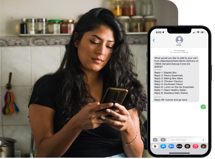
the driver is “nearby” in the same way a distant thunderstorm is technically in the area. Read more →
delivery tracking is one of the few consumer technologies designed to make a perfectly manageable wait feel like a military operation. the driver has accepted the order. the driver is waiting. the driver is apparently moving in a direction that suggests an entirely different meal.
the map is always serene about this. a little icon glides around with the confidence of a person who has never had to find an apartment complex after dark. meanwhile, the food is becoming a philosophical concept.
i do not need a detailed route. i need one honest sentence: ‘there has been a development.’ maybe the driver is on a bike. maybe the restaurant has entered a fugue state. maybe the app has decided miles are a kind of vibe.
i will still order again, obviously. there are some systems we criticize because we believe they can be better, and some we criticize while opening them for the fourth time.
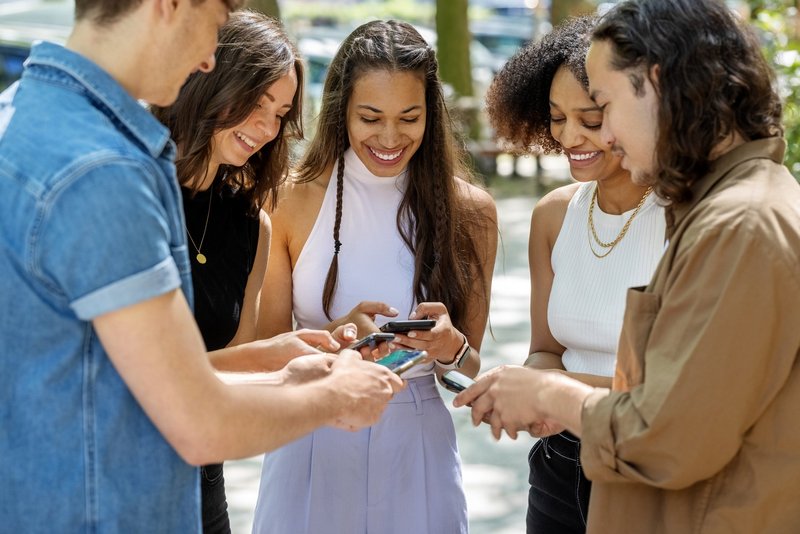
somebody has to announce they have arrived, somebody has to react with a heart, and somebody has to send the screenshot. Read more →
the group chat is where adulthood quietly moved its public square. not the glamorous parts, obviously. the group chat is largely weather complaints, grocery photos, and the collective management of a restaurant reservation nobody wanted to make.
it still performs essential services. it witnesses a bad day. it confirms that a suspicious text is suspicious. it keeps a small but functional archive of jokes that would otherwise have evaporated the moment they were said.
there is always a person who posts the news, a person who posts the meme about the news, and a person who arrives six hours later with a very sincere question that was answered directly above them. democracy survives anyway.
maybe that is why i am protective of it. the group chat asks very little: show up when you can, say something strange, and do not make the shared calendar a hostage situation.
i reblogged this because Firefox asking whether it should save the password i just got wrong has the exact energy of a waiter appearing beside a shattered wine glass to ask if i would like that boxed up.
no, thank you. i would like the browser to avert its eyes while i try the same password again with one capital letter, one exclamation point, and the rapidly deteriorating confidence of a man defusing a bomb he apparently assembled himself.
the prompt has arrived before the verdict
the correct amount of eye contact after a failed login. photo: MarkJFernandes / Wikimedia Commons, CC0.
the password manager is doing what password managers do: noticing a credential field and offering to remember what went into it. Mozilla’s own documentation explains the ordinary, useful version of this feature. the problem is that the prompt sometimes arrives with the timing of a documentary crew asking for comment while you are still falling down the stairs.
the site has said “incorrect.” the browser has said “save this?” somewhere between those two systems is a tiny gap where context was supposed to live.
this is one of the more specific humiliations produced by software that is determined to be proactive. autocorrect confidently preserving the wrong name. a calendar asking whether the meeting that just ruined your afternoon should repeat weekly. a shopping app inviting you to buy again the item you returned because it caught fire.
the computer is not judging you. it has simply automated the part where a coworker repeats your mistake back to you in a meeting.
good error recovery should understand shame
the smallest key with the largest potential to make this feel personal. photo: Tom Harpel / Wikimedia Commons, CC BY 2.0.
software does not need emotions. it does need sequence. if the login failed, wait. if the login succeeds, then offer to save the credential. this is not artificial intelligence. it is artificial tact.
an authentication screen is already an accusation with a text box attached. maybe the password is wrong. maybe Caps Lock is on. maybe the site changed its rules without telling anyone. maybe i am trying the password from a different account because every service demanded a unique one and then punished me for taking that advice seriously.
none of these moments need a museum curator leaning into frame to ask, “shall we preserve this?”
please forget what you have seen here
password managers are good. unique passwords are good. having a browser remember them is much better than discovering, during an airport layover, that your one universal password has apparently become French.
but help should arrive after success, not during the autopsy.
Firefox, i appreciate the offer. for now, please close the tiny filing cabinet and let me fail privately.