

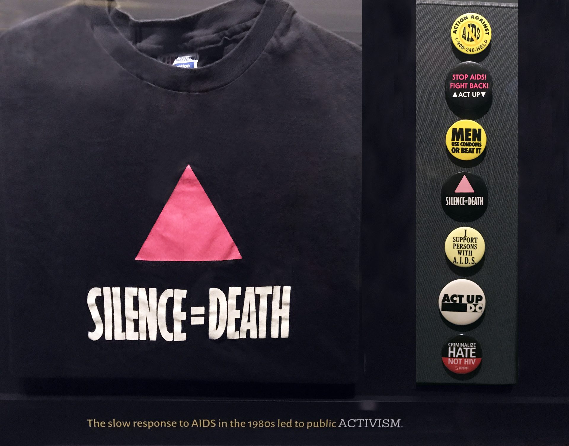
A pink triangle. A black field. Two words connected by an equals sign. The Silence=Death poster is an argument against the idea that a serious message needs a complicated surface.
The design came from the six-person Silence=Death collective: Avram Finkelstein, Brian Howard, Oliver Johnston, Charles Kreloff, Chris Lione and Jorge Soccarás. David Zwirner’s exhibition drawn largely from Finkelstein’s archive documents the poster’s arrival on New York streets in 1987. The National Library of Medicine notes that ACT UP formed separately, weeks after the first posters appeared. The image’s close association with ACT UP should not erase the people who made it.
The economy is not an absence of thought. It is the result of decisions about how much a passerby can take in, how an image behaves at a distance and what a familiar symbol can carry. In the exhibition account, the collective chose abstraction over photographic documentation to address multiple audiences. The poster does not show a patient and ask the viewer to decide whether that person deserves sympathy. It states a relationship and demands that the viewer confront it.
The equals sign does a remarkable amount of work. A sentence might leave space for qualification or polite distance. An equation looks blunt and settled. This one converts a condition into a consequence. The design is not saying that silence is unfortunate. It is refusing to treat silence as neutral.
The triangle adds a different kind of compression. Its history cannot fit inside the shape, but the shape can call that history into the present. The collective reclaimed the pink triangle associated with Nazi persecution and turned it into an assertive graphic. Recognition gives the image force; learning its history gives it more.
Black space is essential to the result. It is not leftover paper waiting for a sponsor logo. It isolates the triangle and makes the white lettering legible without illustration, texture or decoration competing for attention. Everything present has to earn its place. A modern redesign with a dozen helpful additions could easily explain more while communicating less.

The poster’s afterlife also demonstrates the difference between a design and a precious original. Its purpose was circulation: walls, demonstrations, signs, bodies moving through public space. Repetition was not a dilution of the work. Repetition was one of the ways it worked.
The design’s circulation is visible in an ACT UP button preserved by the Missouri Historical Society and in Elvert Barnes’s photographs of the group’s 2017 anniversary gathering. These are later uses of the image, not photographs of its 1987 debut.

That does not mean the image should be reduced to a stylish black T-shirt detached from the crisis and organizing that made it necessary. An attractive form can carry a demand; remembering the demand is part of looking properly. The credited collective and the communities who put the design to use belong in the account alongside the familiar geometry.
A lesson for almost any visual project: clarity is not the same thing as simplification of the subject. A design can be spare because the stakes are enormous, not because the people making it failed to understand them.
This poster did not need more elements. It needed people to act.
sources
David Zwirner: Silence=Death archival exhibition.
National Library of Medicine: AIDS, Posters, and Stories of Public Health.
The Henry Ford: 1987 poster record.
Images: NIAID, AIDS Activism T-shirt and Pins, CC BY 2.0; Gregory Gerhart button, Missouri Historical Society, object 2022-043-0010, collection record, No Copyright–United States; 2017 ACT UP gathering, Elvert Barnes, CC BY-SA 2.0. Silence=Death design by the Silence=Death collective. Images resized for display; no endorsement implied.


leave a reply