Boyfriend Dungeon takes the familiar business of becoming attached to a favorite weapon and removes the metaphor. The weapons turn into people.… Read more
Boyfriend Dungeon takes the familiar business of becoming attached to a favorite weapon and removes the metaphor. The weapons turn into people. You can take them out.
Kitfox describes a combination of dungeon combat and dating, with male, female and nonbinary romance. Dates help the weapons grow stronger. The premise is deliberately silly; the connection between affection and progression is worth taking seriously.
Games regularly ask players to care about an object because its numbers improve. Here, getting to know somebody is part of improvement itself. The date is not a separate reward waiting after the real game. It participates in the system.
The contrast is visible in the developer’s own footage: combat fills the screen with damage numbers and oversized cocktail-glass enemies; a café conversation with Seven instead pauses on dialogue choices. One screen asks how effectively you can act. The other asks what you want to say. That shift in attention is the attraction, not just the joke about a handsome sword.
There is a productive tension in that arrangement. Making affection mechanically useful gives it weight, but also raises the familiar dating-game question: are you choosing this person because you like them, or because the build works? You can notice that tension without demanding that a fantasy comedy solve every problem in the design of intimacy.
The useful invitation is to pay attention to the relationship between the two halves. What does combat teach you to value? What does a conversation ask you to notice instead? The inventory has become a social situation. At least the awkwardness comes with a sharp edge.
Image credits: Boyfriend Dungeon artwork and gameplay frames, Kitfox Games, via the official game page. Limited visual excerpts illustrating the accompanying game-design criticism.
Tom of Finland’s constructed fantasies, the artists behind queer comics, and a Scissor Sisters song that protests rather unconvincingly. Read more
Tom of Finland: drawn, not discovered
The Tom of Finland Foundation identifies the artist as Touko Laaksonen and traces his public byline to 1957. His muscular men are constructed fantasies, not neutral descriptions of what gay men should look like. That distinction makes the work more interesting: exaggeration becomes something to read, not a body standard to pass. The foundation’s history is a better doorway than an unattributed crop circulating online.
Queer comics did not begin when a mainstream publisher discovered an inclusive marketing opportunity. No Straight Lines: Four Decades of Queer Comics, edited by Justin Hall, is a route into the work that was already happening.
The Fantagraphics anthology brings decades of LGBTQ cartooning into one collection. Its value is not just historical reassurance that queer people were there. It gives different voices and drawing styles space beside one another instead of asking one agreeable image to stand in for everybody.
That is also the pleasure of an anthology as a discovery tool. You do not have to turn a first encounter into an exhaustive syllabus. Follow the line, the joke or the way a page addresses its reader. Then learn the name of the person who made it.
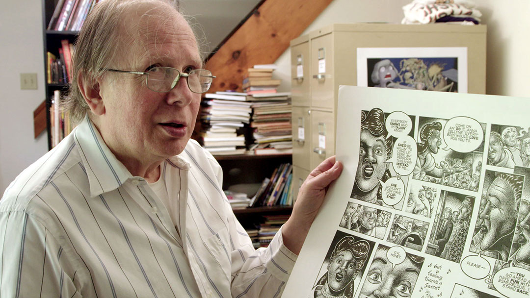
For a companion route, Vivian Kleiman’s documentary No Straight Lines focuses on five artists, including Alison Bechdel, Jennifer Camper, Howard Cruse, Rupert Kinnard and Mary Wings. The book and film are related projects, not interchangeable editions.
The documentary’s press photographs put faces beside the ink: the 1993 OutWrite group includes Jennifer Camper, Diane DiMassa, Alison Bechdel, Rob Kirby, Joan Hilty and Howard Cruse. The separate Cruse-and-Gay Comix image also makes a useful visual argument. A closet literally watches a man outside it; the page knows exactly what it is doing.
This is an after-dark shelf pick with a little ink under its nails: less about finding a respectable origin story, more about noticing how many people built their own space to speak.
A small comic contradiction for the closing track: a dance-pop song whose title declines the invitation. I Don’t Feel Like Dancin’ is listed on the band’s official site and has an official artist-channel video, with Polydor credited. Put it beside the comics as another example of presentation refusing to sit quietly behind the message. The title says no. You can take that under advisement.
Gaultier’s sailor borrows the uniform and declines the duties. A look at stripes, queer fashion and the pleasure of bending a familiar… Read more
A striped sailor top can suggest wholesome seaside recreation. Jean Paul Gaultier has spent a great deal of energy making sure that is not the only available interpretation.
The National Gallery of Victoria holds an ensemble catalogued as Singlet, loincloth and hat. Its account of the work connects Gaultier’s recurring Breton stripe to the sailor as a masculine gay symbol. The Museum at FIT makes the connection equally explicit in its queer fashion exhibition, placing his sailor designs in a cultural line that includes Jean Genet, Fassbinder’s Querelle and Tom of Finland.
So no, this is not just a nice top for the ferry.
The interesting design move is what happens when a uniform stops serving the institution that issued it. Uniforms promise legibility: rank, job, belonging. Fashion can preserve enough of that code to make the wearer instantly recognizable while removing the obligation to behave. A sailor hat and stripes can survive the departure of practically everything else.
That tension is where Gaultier’s version gets its charge. The outfit points toward discipline, but the styling proposes pleasure. It borrows the authority of an established masculine image without accepting that image as a limit. A familiar code becomes available for exaggeration, play and deliberate display.
The stripe is particularly efficient. It organizes the surface of a garment while drawing attention to the shape carrying it. On a flat object it is a graphic. Around a torso it has a second job. Change the fit, the neckline or the amount of fabric and the same recognizable pattern produces a different proposition. There is no need to embroider “subtext” across the chest. The chest is handling it.
The 2013 Rotterdam exhibition puts the trick in plain sight: sailor collars and stripes turn up on a cropped top, a lace gown and a sheer mermaid silhouette. The uniform remains recognizable even when the material, cut and wearer no longer follow its rules. Reporting for duty is apparently optional.
The museum accounts matter because they rescue this work from the lazy description of anything playful as a joke. Camp is not the absence of construction. It often depends on knowing a visual rule precisely enough to bend it without making it disappear. If the sailor ceased to be recognizable, much of the pleasure would go with him.
Nor does the queer context require deciding that every person in stripes is sending a message. Clothes accumulate associations; they do not issue reliable personal biographies. Gaultier’s work makes room for a wearer to borrow a fantasy, not a requirement to pass a test of authenticity.
This is why the sailor remains a useful figure for a style column interested in attraction rather than shopping links. The appeal is made, not discovered. It comes from the distance between an ordinary garment and the deliberate arrangement around it: the posture, the proportion, the missing seriousness.
A uniform normally tells you what someone is supposed to do. Gaultier’s sailor makes a compelling case for taking the afternoon off.
A dating game about fathers should not feel like a radical casting decision. Still, Dream Daddy makes an unusually clear choice: the… Read more
A dating game about fathers should not feel like a radical casting decision. Still, Dream Daddy makes an unusually clear choice: the dads are the romantic leads, not the people standing beside the interesting characters.
Game Grumps’ own description puts the premise plainly. You play a dad, meet other dads and pursue romance. The joke is in the title, but the premise has a useful consequence. Parenthood and desirability are allowed to occupy the same character.
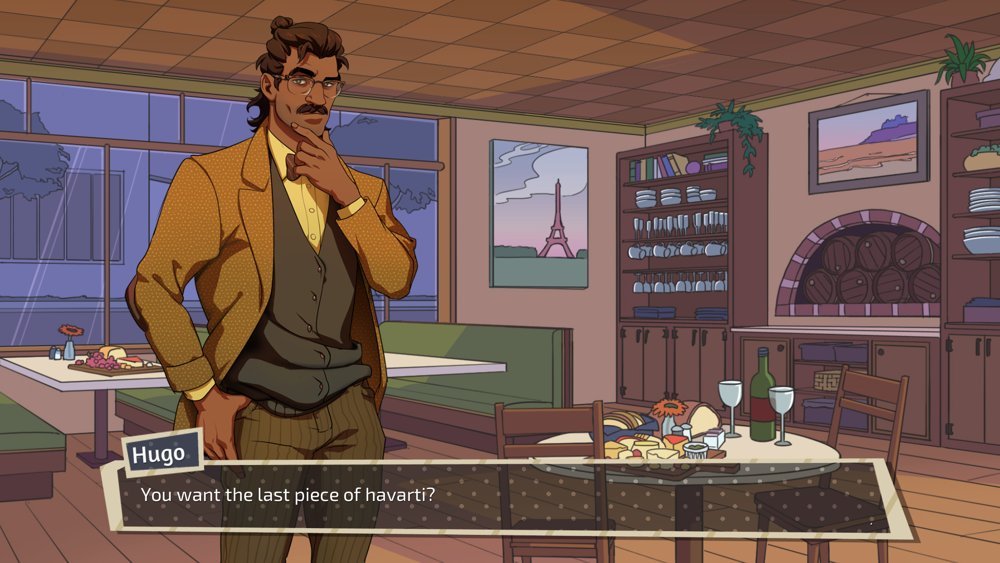
The developer’s screenshots make the range visible without an abstract promise of inclusivity: Hugo’s glasses and mustard jacket offer a different romantic silhouette from Robert’s leather jacket and late-night setting. The character creator puts facial hair and other appearance choices in the player’s hands, too. Desirability is not confined to one man’s wardrobe—or to the men you can date.
Gay visual culture can be very good at making an ideal body visible and much less interested in the life attached to it. A dad arrives with evidence that he already has a life. The fantasy is not necessarily escape from responsibility. It can be the possibility of being wanted while having responsibilities.
That is the angle worth carrying into the character creator and the dates: what kind of adult gets to be attractive, and what parts of him are treated as baggage? A broader romantic cast is not only a matter of adding more silhouettes. It can change what the game thinks a happy life might contain.
The dad jokes are part of the package. The permission to have a second act is the more interesting feature.
Image credits: Dream Daddy screenshots, Game Grumps, via the official Steam page. Limited visual excerpts illustrating character design and customization.
Keith Haring, Gregg Araki’s The Living End and Perfume Genius’s Queen: three ways to be visible without being agreeable. Read more
Keith Haring: beyond the merchandise
Keith Haring’s line is familiar enough to become visual wallpaper. His foundation’s biography is a useful way back to the artist: public drawing, accessible imagery and an involvement with subjects including sex, war, birth and death. Look for the purpose behind the recognizable style. An image can be immediately legible without being politically empty.
Not every queer film needs to arrive with a reassuring handshake. Gregg Araki’s The Living End is a useful reminder that cinema can also be angry, sexual and deliberately difficult company.
Strand Releasing describes the film as an outlaw-couple romance about two HIV-positive men on the run in 1990s America. Mike Dytri and Craig Gilmore star. Araki later personally remastered, recolored and remixed the film.
The premise joins intimacy to flight rather than settling down. That makes it an interesting counterpoint to the idea that queer representation earns its value by presenting exemplary citizens. A fictional character can be compelling without being a spokesperson, a role model or somebody you should trust with your car.
The point is not to turn illness into a metaphor for danger. It is to recognize that a story about people living under social pressure does not owe its audience a soothing response. Desire, rage and humor are allowed to share the frame.
For an after-dark watchlist, this is the pick for a night when polished reassurance sounds less useful than a rough edge. It is a film to engage with, not a lifestyle brochure.
For the music slot, Queen comes with a useful maker credit: Perfume Genius’s official page identifies SSION as its director and Too Bright as its album. Let the video sit beside Araki rather than using it as background decoration. Both selections make a useful starting point for thinking about the difference between being visible and being agreeable. Nobody here needs a corporate welcome banner.
Featured image: Keith Haring painting at the Palladium, May 1985. Bernard Gotfryd / Library of Congress, via Wikimedia Commons; no known copyright restrictions on the photograph. Artwork by Keith Haring. Body: Keith Haring at the Stedelijk Museum, March 14, 1986. Rob Bogaerts / Anefo / Nationaal Archief, via Wikimedia Commons (CC0). Perfume Genius at Interstellar Rodeo, Edmonton, 2019: Levi Manchak, via Wikimedia Commons (CC BY 2.0), resized without cropping. This is an archival concert photograph, not a still from Queen.
A square of fabric is an admirably low-maintenance communication device. No battery, no notification settings, no man announcing that he is “rarely… Read more
A square of fabric is an admirably low-maintenance communication device. No battery, no notification settings, no man announcing that he is “rarely on here” while remaining permanently online.
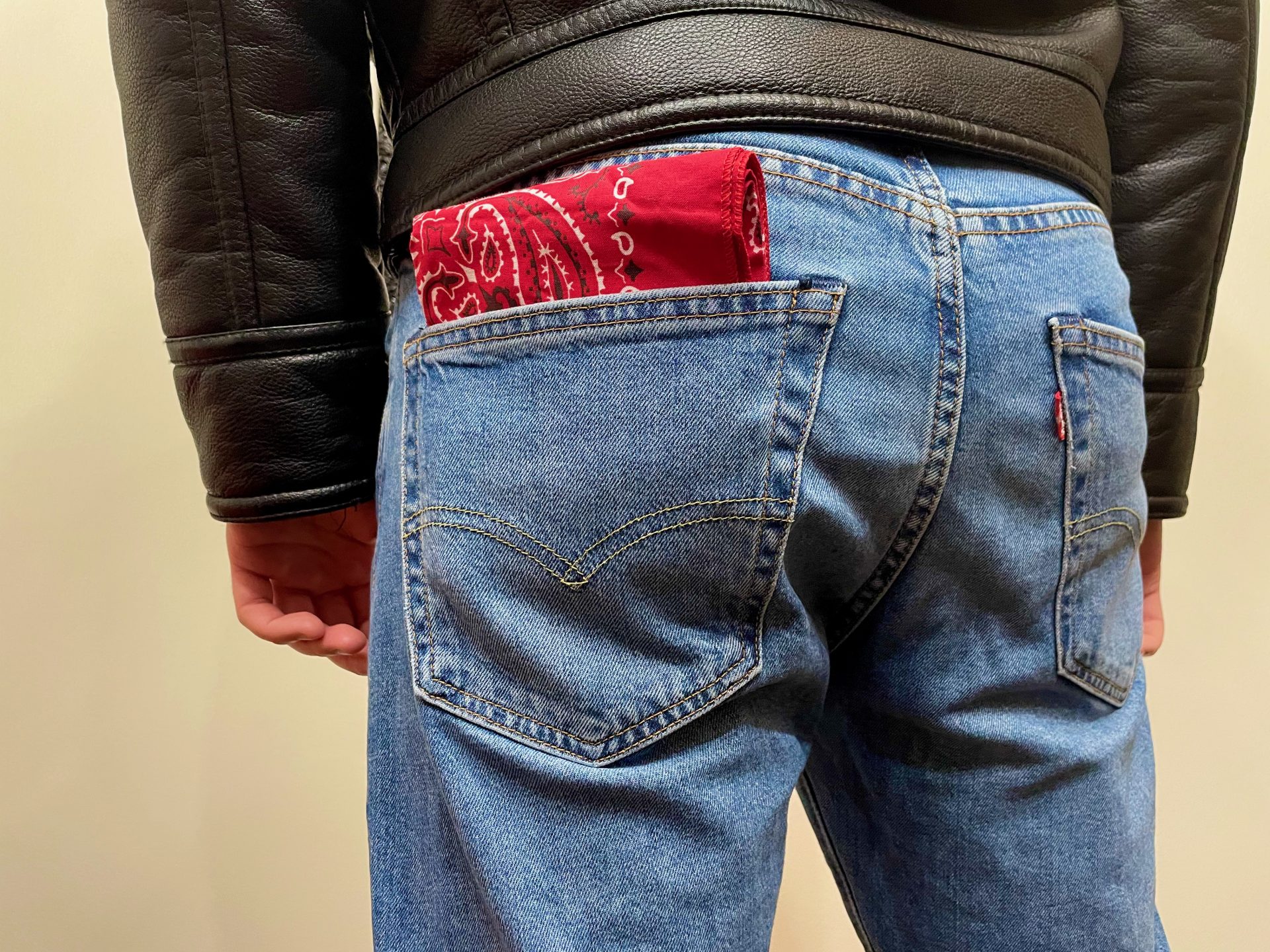
The hanky code used color and placement to communicate sexual interests. In its account of the practice, Queer History Boston describes bandanas worn in back pockets among queer men in the 1970s and 1980s, with printed decoder cards distributed by shops and bars. The material was ordinary. The shared reading made it useful.
That is the design story worth paying attention to: not an exhaustive color chart, but an everyday object acquiring an additional layer of meaning. The bandana does not need a screen because the person looking supplies the decoder. To someone outside the convention, it can remain a bandana. To somebody who recognizes the signal, it can begin a conversation.
There is pleasure in that economy. An accessory becomes both part of an outfit and a piece of information. It can be removed, changed, folded down or made more conspicuous. The wearer has a kind of immediate control that a permanently circulating profile photograph cannot quite offer.
The printed cards are just as important as the cloth. Queer History Boston notes that businesses supplied lists alongside bandanas and that bars used the cards to advertise their locations. So the system was not purely spontaneous, whispered knowledge. It had a small publishing and distribution infrastructure. Someone had to make the convention readable, and someone had to put that explanation where interested people could find it.
That commercial detail does not cancel the culture. It makes the culture tangible. Shops, bars and printers helped circulate the vocabulary. Desire needed places to meet, and those places needed people to know they existed. A pocket-sized key could do more than one job.
It is tempting to turn this into a nostalgic claim that communication used to be simpler. It was not necessarily simple, universal or safe. A code depends on context, and different readers may not share the same assumptions. The sensible modern lesson is not that a piece of cloth can replace a conversation. It is that communities can make meaning out of things that were not sold to them as communication platforms.
For the same reason, a bandana is not proof of anyone’s orientation or preferences. Even within a scene, a signal is an opening, not consent. Outside it, the accessory may be doing nothing more complicated than keeping hair out of somebody’s face. The distinction is not a prudish footnote; it is what keeps the design from being mistaken for a machine that can read people.
The best part of the hanky code is its modesty as an object. A little cloth, a shared convention, a possibility of recognition. It does not need to know your location continuously. It only asks whether somebody nearby understands what you chose to show.
Not every interface needs a venture-capital round.
In The Talented Mr. Ripley, attraction comes with an excellent travel budget. Anthony Minghella’s 1999 film places Tom Ripley beside Dickie Greenleaf,… Read more
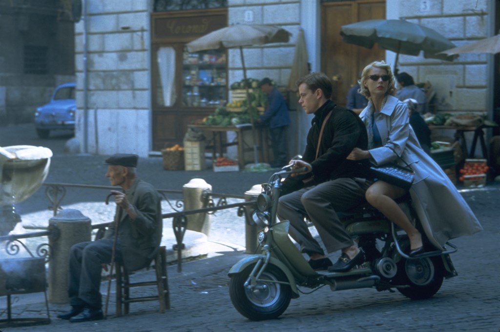
In The Talented Mr. Ripley, attraction comes with an excellent travel budget. Anthony Minghella’s 1999 film places Tom Ripley beside Dickie Greenleaf, a wealthy American enjoying Italy on his father’s money. Tom wants Dickie. He also wants the life in which being Dickie appears so effortless.
That overlap is more unsettling than a simple unrequited crush. Wanting someone and wanting to be someone can look remarkably similar from a distance: study his clothes, learn his tastes, arrange to be where he is. The difference becomes harder to ignore when admiration starts behaving like a claim of ownership.
Paramount’s synopsis explicitly identifies both Tom’s attraction and his envy. Neither needs to be reduced to a diagnosis of queer desire. The film’s useful discomfort is more specific: what happens when intimacy is confused with admission to a better class of life?
Jude Law’s Dickie is the invitation; Matt Damon’s Tom is the person reading the fine print. The seduction includes beauty, but also leisure, money and the apparent freedom not to explain yourself.
The poster makes that imbalance visible before the story begins: Tom’s face dominates the foreground while Dickie and Marge occupy the warmer, apparently easier world behind him. It sells proximity and separation in the same image.
A handsome man is one thing. A handsome man who seems exempt from consequences is a considerably more dangerous sales pitch.
Rock Hudson’s romantic appeal was more than a jawline. Gentleness, clothing and screen performance did their share. Read more
thirst, with footnotes · no. 2
Rock Hudson had the kind of face that makes a studio publicity department look overstaffed. But a jaw is not a performance. The interesting part is what he did with the rest of the picture.
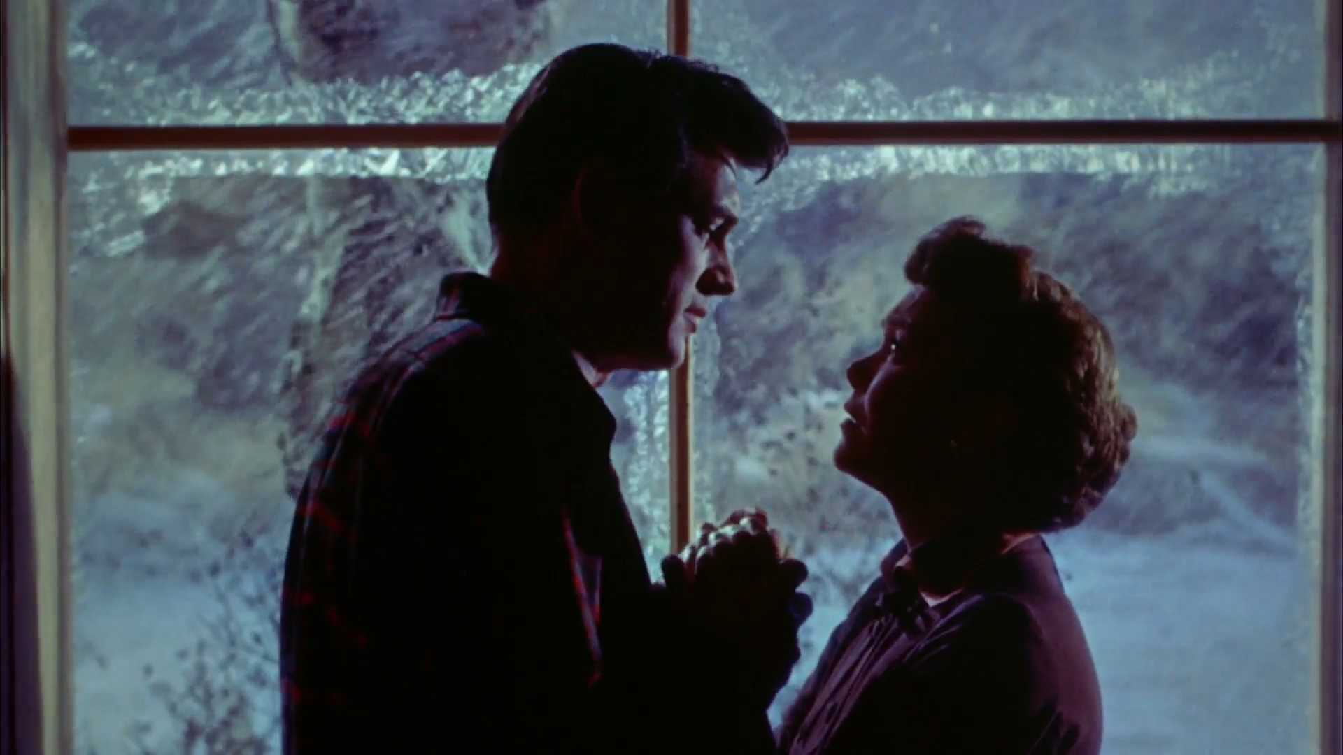
In its account of Hudson’s 1950s melodramas, the BFI identifies a particularly potent combination: masculinity and gentleness. That is a better starting point than treating him as a walking monument. In Douglas Sirk’s All That Heaven Allows, his romantic appeal is not simply that he occupies considerable space. It is that his presence offers an alternative to the social world pressing in around Jane Wyman’s character.
The film’s premise is easy to describe without spoiling its progress: a widow falls for her younger gardener, and other people develop an exhausting interest in the arrangement. The Criterion Collection’s synopsis places class and conformity at the heart of the opposition. Hudson’s body is therefore not neutral decoration. It belongs to the man the surrounding community would prefer she did not choose.
That gives the clothes something to do. Relaxed, practical-looking clothing makes a different offer from the formal codes of respectability around the couple. The fantasy is not merely “handsome man.” It is a handsome man who seems capable of existing outside a committee. For a film filled with scrutiny, the possibility of not performing for the neighbors is practically an aphrodisiac.
This is also why a publicity portrait cannot tell the whole story. Edward T. Estabrook’s 1953 photograph, published in Photoplay, gives us the controlled construction of a star: the face, the hair, the arrangement of light. It is an excellent object to look at. A movie adds duration, response and the possibility that the impressive-looking man might actually listen.
There is a temptation to discuss Hudson entirely through the distance between his public screen image and his private life. His history matters, but making every performance a puzzle with one biographical solution diminishes the work. A gay audience does not need to pretend the heterosexual romances are secretly different plots in order to find pleasure in them. Looking at the leading man is already permitted. The camera has gone to some trouble to assist.
The useful comparison is with Pillow Talk, his 1959 comedy with Doris Day. A different genre asks a different service from the same screen presence. The sculpted, reliable-looking exterior can carry romantic reassurance in one film and become part of a comic performance of confidence in another. The appeal is not a fixed property stored in the cheekbones. It is shaped by the scene.
That is the enduring argument for Hudson as a heartthrob rather than a handsome historical document: beauty gets him into the frame; modulation makes him worth staying with.
The shoulders are persuasive. The gentleness closes the deal.
A nearly empty tower block, parents who still answer the door, and the unsettling distance between getting out and feeling free. Read more
An empty flat looks very different depending on whether someone is expected back. The same clean surfaces, the same closed door. One version is peaceful. The other has started to feel permanent.
Andrew Haigh’s All of Us Strangers gives that silence an entire tower block. Adam, played by Andrew Scott, lives in a nearly empty London building. Harry, played by Paul Mescal, is a neighbour who interrupts his solitude. Elsewhere, Adam’s dead parents are apparently still at home, unchanged by the thirty years he has had to live without them. That is the premise laid out by Searchlight, and it is already enough to make a perfectly ordinary evening feel suspect.
The modern building is the detail that keeps catching. A haunted house usually comes with a warning in the architecture: the bad staircase, the sealed room, the wallpaper nobody should have chosen. This one could be an upgrade. Somewhere you might move when life is finally supposed to be getting better.
There is something particularly bleak about giving loneliness an expensive-looking address. The room has been delivered. The life that was meant to happen inside it remains outstanding.
the past still answers the door
The parents are a more intimate disturbance. Adam can return to them, but returning does not make the intervening years disappear. Ben Walters’s Sight and Sound review is useful on the uncomfortable coexistence of parental tenderness and inherited homophobia. Affection does not automatically supply understanding. A parent can love a child and still help teach that child to hide.
That is a cruel thing for a ghost story to leave intact. Bringing people back would be so much easier if they returned with the right vocabulary, a complete apology and the benefit of everything learned in their absence. Haigh allows the reunion to be more awkward than that.
The fantasy of going home tends to leave out the conversation you would have once you got there.
the happy ending has a long commute
Queer adulthood is often described as an eventual destination: get out, come out, find your people. There are good reasons those promises matter. But a destination can become another way to judge the person who has reached the right city, acquired the right freedoms, and is still eating alone.
The most troubling question here is how much of a life can be spent waiting to feel as though it has begun. A new address can make that waiting less visible. So can a relationship. Neither comes with a receipt for the years already spent.
Scott and Mescal supply the romance, but the premise refuses to let desire clear the building of everything that was there before it. There is another person within reach. There is also a whole past in the room.
This is the darker companion to the Weekend conversation from Sunday: what happens when the time available to two men is crowded by time that cannot be recovered?
The unnerving thing about the flat is how little it needs to change. Someone could come over. The light could stay on. From outside, it would be almost impossible to tell the difference.
There is a temptation to approach an RPG romance like equipment: find the preferred companion, make the correct selections, collect the reward.… Read more
There is a temptation to approach an RPG romance like equipment: find the preferred companion, make the correct selections, collect the reward. Very efficient. Also a slightly bleak way to describe a boyfriend.
In its early design explanation for Baldur’s Gate 3, Larian framed relationships around companions with their own motivations, opinions and responses to the player’s decisions. Its discussion of camp was especially useful: a place for conversation after the adventure, not just preparation for the next fight.
That is a worthwhile lens for queer romance in games. Letting a male character pursue another man is the starting point. Giving both of them something to negotiate makes it a relationship rather than a checkbox.
The promotional images make the distinction visible: the character creator offers neatly labeled choices, while Shadowheart’s close-up gives attention to a face and an object whose significance is not contained in a stat panel. The party vista supplies the other half of the fantasy: a journey shared with people, rather than a collection of bonuses.
The interesting question is not only whether a companion approves. It is what that approval asks the player to become. Do you keep a principle when it disappoints the person you fancy? Does attraction make an obviously bad suggestion sound unusually reasonable? A fantasy adventure has room for those small, embarrassing stakes alongside its large, expensive ones.
This is not a route guide or a promise of a particular ending. It is an invitation to treat the conversation as more than a lock with a horny combination.