
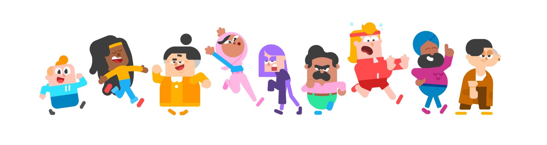
I asked whether the Duolingo characters count as Corporate Memphis, and then immediately wondered whether they would get a makeover now that the look feels a little passé. this is what happens when your brain turns a language app into an unsolicited design meeting.
you know the look. friendly people assembled from shapes, improbable limbs, colors selected by a committee that has heard of diversity but would prefer not to discuss anybody’s actual life. a cheerful person reaches toward a floating rectangle. the rectangle may be a mortgage application, a productivity dashboard, or your termination paperwork. the person is thrilled.
Duolingo clearly lives in the same visual neighborhood. but I think the distinction matters: the owl has a personality. the people on your bank’s landing page usually have a responsibility to avoid having one.
a circle is not a moral failure
“Corporate Memphis” is useful shorthand for an overfamiliar corporate illustration aesthetic. it becomes less useful when it means every flat cartoon with rounded edges. that definition would allow us to arrest half of children’s television. occasionally a shape is just a shape, even when it has accepted venture capital.
Duolingo’s explanation of its shape language describes a deliberate system built around simplifying forms and exaggerating important details. its character-design history ties the human cast to Duo’s visual world. these are choices made to build something recognizable, not evidence that a circle has committed fraud.

my test is embarrassingly simple. remove the logo. can I still tell whose people these are? better yet, can I tell which person is which without looking at their shirt? Duolingo clears that bar. Lily looks like she would rather be somewhere else. a corporate illustration person usually looks like they have never been allowed to consider somewhere else.
the difference is not whether the design is commercial. of course it is commercial. the bird has a job. the difference is whether the design permits a character to feel anything that might complicate the sales pitch.
personality requires the possibility of being annoying
a mascot you can dislike is doing more character work than a silhouette you cannot remember. Duo can be overbearing. the app’s whole motivational presence can feel like a tiny supervisor who lives in your phone. that irritation is still a relationship. you recognize the source of it. you can make a joke about it that would not work with every other logo substituted in.
meanwhile, the generic corporate person floats through a world without friction. no unflattering posture. no boredom. no suspicion about the floating rectangle. everybody has apparently read the privacy policy and found it spiritually nourishing.

Duolingo has already reworked Vikram, describing consultation about representation alongside changes to his shapes. that is a much more interesting reason to adjust a character than “the internet has decided rounded people are cringe.” it asks what this particular design communicates and to whom.
please do not give the owl a tasteful beige era
my worry is that recognizing a trend’s exhaustion becomes an instruction to erase everything built with its tools. a company decides flat illustration is out and trades the familiar cast for glossy gradients, vaguely handmade scribbles, or whatever the next mood board calls human. six months later, every landing page has the new version of the same problem.
I have a standing interest in websites being allowed to have a personality. the same permission should extend to their little inhabitants. consistency does not have to mean interchangeability. polish does not have to mean removing every visible opinion.
keep the shapes if they serve the characters. change the shapes if they stop serving them. but do not make the owl less weird because your bank hired a purple woman to hold an enormous credit card.
she is not his fault.
Featured image: Artwork: Duolingo. https://blog.duolingo.com/building-character/ — reproduced for design criticism.