Erin Reed’s 2023 and July 2026 trans legal-risk maps show more than a bad legislative season. They show ordinary travel becoming a… Read more
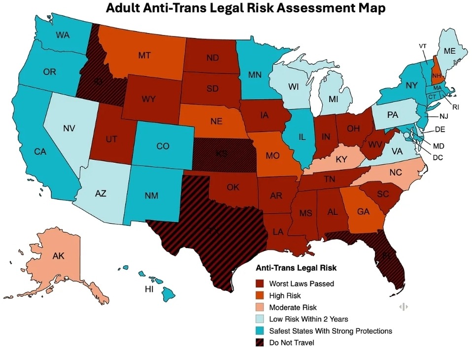
i reblogged a comparison between Erin Reed’s 2023 anti-trans risk map and her July 2026 update because sometimes a picture does exactly what a hundred individual headlines cannot: it shows the direction of travel.
the map is not an official travel advisory, and it should not be treated like one. Reed describes it as a qualitative legal-risk assessment built from five years of tracking bills, hearings, court fights, executive actions, and reports from organizers in each state. that distinction matters. so does the fact that people need this kind of map at all.
the colors did not merely move
Erin Reed’s Adult Anti-Trans Risk Assessment Map, 2023. Source: Erin in the Morning; used for commentary and historical comparison.
in the 2023 version, Florida stood alone in the map’s striped “Do Not Travel” category. the July 2026 adult map puts Florida, Idaho, Kansas, and Texas there. South Carolina moves into “Worst Laws Passed.” Reed’s accompanying report, published July 13, says Idaho’s new bathroom law can expose a trans person to a felony and a prison sentence of up to five years, while South Carolina expanded its bathroom restrictions to colleges and universities.
this is what makes the comparison more useful than treating each new restriction as a discrete piece of bad news. laws do not arrive alone. they stack. a bathroom ban sits beside restrictions on identity documents, health care, schools, public employment, and legal recognition. eventually “can i use this restroom?” becomes “can i safely cross this state?” which is a deranged question for a person to have to answer before filling the gas tank.
and then there is the map for kids
Erin Reed’s Youth Anti-Trans Legal Risk Assessment Map, July 2026. Source: Erin in the Morning; used for commentary and comparison.
the youth map is the one that stops me. there is no low-risk category left anywhere in the country. Reed writes that federal policy, pressure on schools and hospitals, and the broader spread of state restrictions have pushed every state to at least moderate risk for trans youth.
another useful check is the Movement Advancement Project, which tracks more than 50 LGBTQ-related laws and policies in real time. its current gender-identity policy scores put 22 states, plus three territories, in the negative category. it is a different methodology answering a different question, but the broad shape is familiar: protections are concentrated, penalties are spreading, and geography increasingly decides how much of your ordinary life the government considers negotiable.
maps like these are practical tools, but they are also records of policy failure. the country is being recolored in ways that turn moving, traveling, going to school, getting a prescription, or using a public building into legal-risk calculations. we have somehow rebuilt the trip planner as a civil-rights document. very efficient. extremely normal.
the legal landscape changes quickly. check the dated methodology and state details in Erin Reed’s July 13, 2026 report, and consult qualified local counsel or advocacy organizations for legal advice.
an ancient mapping service declined one pointless authoritarian branding exercise and discovered that “no” is still a very popular feature. Read more
MapQuest, a website I associate primarily with printing six pages of directions and then immediately missing the second turn, is suddenly the most politically relevant mapping service in America.
President Trump ordered Lake Ontario renamed “Lake America.” Google and Apple changed the label for users in the United States. MapQuest said no, kept the familiar name, and watched people download its app in numbers normally reserved for products they remembered existed before that morning.
MapQuest is now the No. 1 U.S. app after bucking Trump’s ‘Lake America’ renaming
TechCrunch reported on August 31 that MapQuest had reached No. 1 in the U.S. Navigation category, No. 4 among non-game apps, and No. 8 across the entire App Store. The company said usage had jumped to 50 times its normal level. By September 2, the Associated Press reported that it had topped the free-app charts in both the United States and Canada.
MapQuest app promotional screenshot, via the Apple App Store; reproduced for commentary.
the ancient texts foretold this
I remember MapQuest as infrastructure from the era when going somewhere new required a printer, a passenger willing to read aloud, and a solemn family agreement that nobody would mention the missed exit until Dad had finished being mad at the interstate. You did not “reroute.” You performed a three-point turn in a bank parking lot and hoped geography eventually forgave you.
Google Maps made all of that feel prehistoric. Apple Maps arrived later, initially with the confidence of a person who had never personally encountered a bridge. MapQuest remained alive in the background, apparently waiting for the exact moment that declining to participate in a pointless act of nationalist branding would qualify as product innovation.
Map by Phizzy, via Wikimedia Commons, licensed CC BY-SA 3.0.
sometimes “no” is a feature
The funny part is that MapQuest says it is not trying to make a grand political statement. General manager Doug Berger framed the decision as keeping the names users already know. This is technically customer service, which now counts as resistance because the baseline is apparently “change the map whenever the president invents a new noun.”
There is a useful lesson here for brands, institutions, and the many Democrats who react to every absurd demand by assembling a committee to determine how quickly they should comply. People are desperate to see somebody say no. It does not need to be delivered from a barricade. It can be a mapping app calmly declining to pretend that one of the Great Lakes received a patriotic software update.
MapQuest also released a tool that lets users give the lake their own joke names. This is both clever marketing and an appropriate response to governance by novelty merchandise. If the federal government is going to operate like a novelty T-shirt kiosk, the least the rest of us can do is make better jokes.
I do not know whether everybody downloading MapQuest will keep using it. Protest downloads are easy, and changing a default navigation app is harder than people admit. But even a temporary surge matters. It demonstrates that refusing to normalize something stupid can be popular, useful, and, most offensive to conventional wisdom, good for business.
Thirty years after helping America get lost with a stack of warm printer paper, MapQuest has found the route back to relevance. It was apparently just “continue straight past the authoritarian branding exercise.”
in 2009, (500) Days of Summer felt precision-engineered for being 20. revisiting it now means seeing both the movie and the person… Read more
there are two ways to answer “what was your favorite movie when you were 20?”
you can name the movie from that year you currently believe is the best, after another seventeen years of watching films, acquiring opinions, and becoming the sort of person who knows when a director is “interrogating” something. or you can answer honestly and identify the movie that got you then.
for me, in 2009, that movie was (500) Days of Summer.
Without saying your age, what is your favorite movie that came out when you were 20 years old?
the question was “favorite movie released when you were 20,” not “please submit your revised adult canon after several rounds of peer review.”
a movie precision-engineered for being 20 in 2009
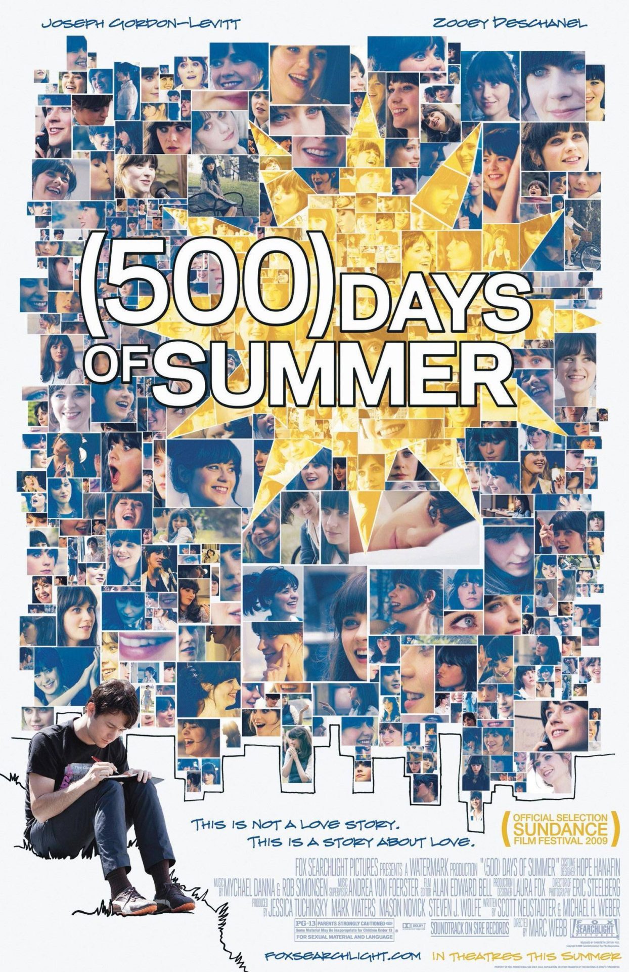
(500) Days of Summer arrived carrying nearly every signifier that could activate a 20-year-old in 2009: the Smiths, greeting-card melancholy, architecture as an abandoned dream, Zooey Deschanel’s bangs, Joseph Gordon-Levitt in narrow ties, nonlinear editing, and an elaborate Hall & Oates dance number presented as an emotional weather report.
it did not merely have a soundtrack. it had a soundtrack that seemed designed to be imported into iTunes, burned onto a CD for somebody you were pretending not to be in love with, and then listened to while staring out the passenger-side window like your suburb had been photographed by an unusually sympathetic cinematographer.
the movie understood that being 20 means your feelings are both completely ordinary and, somehow, the first time they have ever occurred in human history. everybody has been rejected. nobody has been rejected with this particular Regina Spektor song playing.
the embarrassing luxury of identifying with tom
the first time through, it is remarkably easy to accept Tom’s version of events. he is sad, he has excellent taste according to a very specific 2009 rubric, and the movie is literally assembled from his memories. the camera gives his disappointment production design. even his depression has an aesthetic department.
but the film tells you, repeatedly, that he is unreliable. Summer says what she wants. Tom hears what he hopes she will eventually want after enough exposure to his personality. he mistakes shared music taste for metaphysical compatibility, which is a deeply 20-year-old error and, regrettably, not one that expires automatically at 21.
watching it now, the “expectations versus reality” sequence feels less like a clever formal trick and more like the whole thesis arriving with labels. Tom is not devastated because Summer secretly promised him a future. he is devastated because he treated his imagined future like a contract she had failed to honor.
your favorite then does not have to be your favorite now
this is where the social-media prompt became more interesting than a simple list of 2009 releases. there are movies from that year I may rank higher now. that is not quite the same question.
a favorite movie is sometimes a time capsule with a runtime. it preserves who you were when you encountered it: which jokes landed, which clothes looked aspirational, which flaws in a protagonist still read as romantic damage instead of a warning label, and which songs could make an ordinary elevator ride feel like destiny had finally started paying attention.
revisiting that movie is not a test you pass by having the correct updated opinion. you are allowed to notice what aged badly, what you misunderstood, and what remains annoyingly effective. critical distance is useful, but it does not need to arrive carrying bolt cutters.
the film survived its own aesthetic
late-aughts indie culture has become easy to parody because it was already halfway to parody while it was happening. there were birds on things. every apartment had a vintage typewriter owned by someone who did not type. men believed that liking the Smiths qualified as emotional availability.
(500) Days of Summer contains all of that, but it has lasted because its structure is smarter than its accessories. memory is nonlinear. heartbreak is an editor who keeps cutting back to the scene that supports its preferred argument. eventually, if you are lucky, the footage gets recut.
at 20, I saw a stylish movie about the devastation of wanting someone who did not want the same thing. now I see a movie about the danger of confusing your narration with reality. both readings were sitting there. I was simply seated closer to one of them.
the official Searchlight trailer, featuring enough late-aughts romantic fatalism to power several American Apparel stores.
so, yes: my answer is still (500) Days of Summer. not necessarily because it would win a carefully administered ranking today, but because “favorite movie when I was 20” belongs partly to the 20-year-old who answered it first.
being the fun uncle is mostly controlled irresponsibility, available attention, and discovering that your lower back has become deeply conservative. Read more
there is a particular moment in adulthood when you realize you have become furniture.
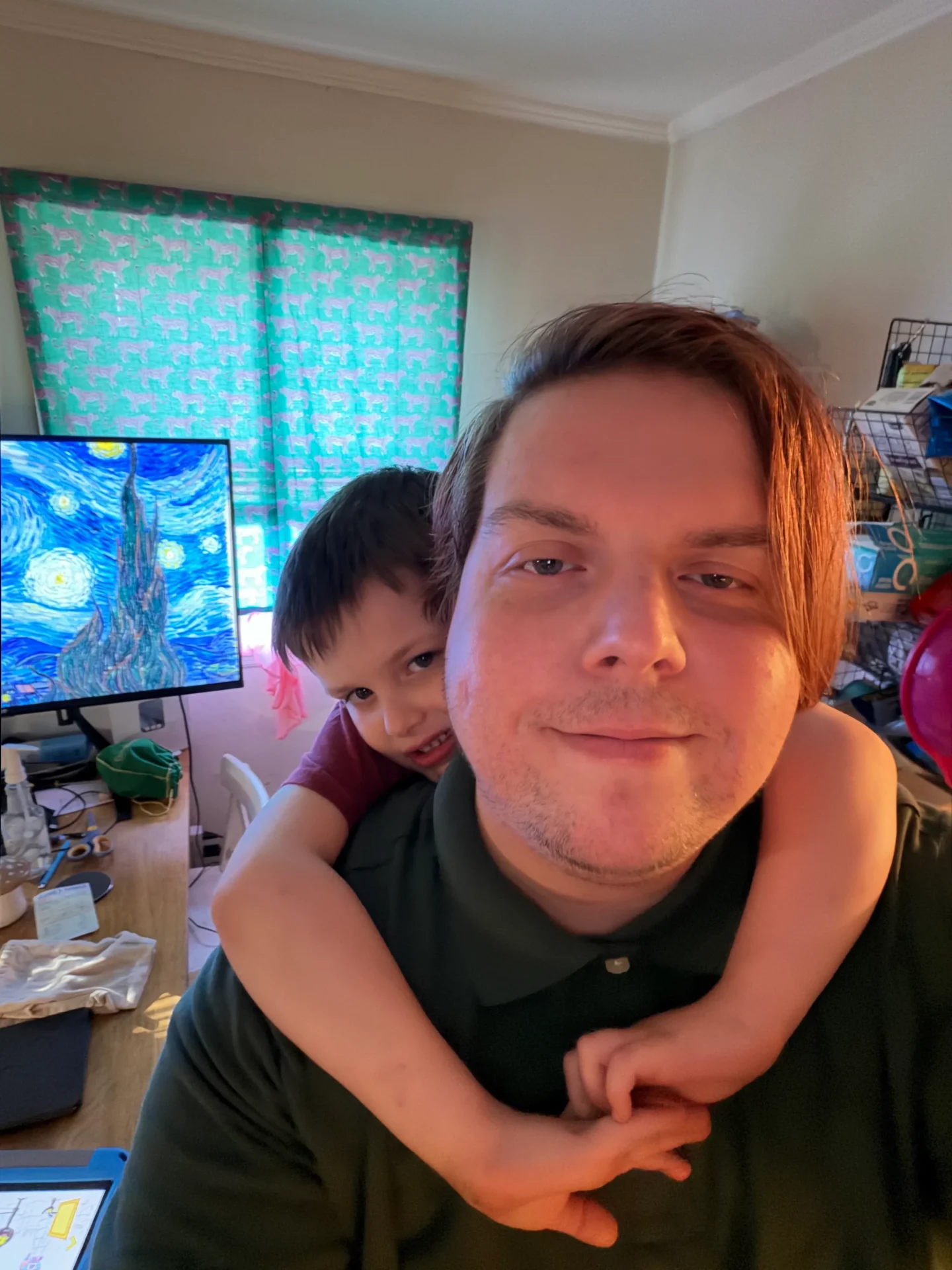
not metaphorically. i mean a small child has looked at your back, performed several calculations involving leverage and the complete absence of fear, and decided you are now part of the climbing wall.
#uncmaxxing: apparently the final form of having a nephew is becoming playground equipment.
children do not recognize personal space as a legal concept
my nephew Sam hanging off my back in the kitchen is not an unusual event so much as the natural outcome of being within grabbing distance. children do not ask whether you are prepared to become a ride. they simply begin boarding.
this is one of the stranger pleasures of being an uncle. parents have to maintain civilization. they are responsible for meals, bedtimes, school forms, shoes that have somehow vanished while still being inside the house, and the ongoing investigation into why everything is sticky. an uncle can arrive, make the situation louder, get climbed like a moderately stable tree, and then leave before anyone has to locate a matching pair of socks.
it is an excellent system, especially for the uncle.
Family play does not need an objective beyond everyone agreeing to the same small, temporary world. Photo by Bill Branson for the National Cancer Institute, via Wikimedia Commons. Public domain.
the fun uncle is mostly controlled irresponsibility
people talk about being the “fun uncle” like it requires gifts, elaborate outings, or a convertible purchased during a manageable midlife crisis. mostly, it seems to require being willing to participate in whatever bit a child has started without immediately asking where the bit is going.
the answer is usually nowhere. this is the beauty of it.
adults are forever trying to make activities produce something. the walk should count as exercise. the hobby should become a side hustle. the photograph should be optimized for a platform. even relaxing has developed performance metrics. did you hydrate? did you practice mindfulness? did you extract the maximum restorative value from sitting completely still?
a kid will spend twenty minutes repeatedly falling off the same cushion because the fall made a funny noise once. this is a far more honest relationship with leisure.
Sometimes “being available” is simply treating a child’s current project like the important briefing it clearly is. Photo by Nenad Stojkovic, licensed CC BY 2.0.
being remembered as available
i do not remember every toy I had as a child, and I definitely do not remember which adults bought most of them. I remember who was willing to get on the floor. I remember the adults who listened to an explanation that made no sense and responded as though I had presented a complicated but potentially viable infrastructure proposal.
that is probably the actual job. not performing childhood enthusiasm perfectly, but making room for it. being the adult who can be interrupted by a very urgent report about a bug, a cartoon, or an object found under the couch. being someone whose attention does not always have to be earned by doing something impressive.
it is easy to forget how much power adults have over the atmosphere in a room. we decide whether something is annoying, embarrassing, too loud, too weird, or worth joining. sometimes the kindest possible response is to accept that you have been assigned the role of mountain and crouch down a little so the smaller person can get a better grip.
uncmaxxing has terrible ergonomics
none of this means my spine has endorsed the arrangement.
being an uncle in your late thirties introduces a widening gap between your emotional willingness to roughhouse and your lower back’s deeply conservative interpretation of the same proposal. the child sees a beloved relative. the lumbar region sees an OSHA violation.
still, there are worse ways to discover that you are no longer young than having someone assume you are strong, safe, and probably willing to make a ridiculous noise when they climb aboard.
I can work with that.
originally inspired by a moment posted on Bluesky. The embedded photograph includes alt text on the source post.
The old web was often ugly, broken, and deeply inconvenient. It also looked like somebody lived there. Keep the competence; bring back… Read more
i miss websites that were allowed to be weird.
not “the old internet was better,” exactly. the old internet was frequently worse in ways we have either forgotten or converted into charming anecdotes because nobody wants to remember waiting three minutes for a midi file to load. pages broke if you looked at them from the wrong browser. navigation was a scavenger hunt. half the images were red x’s. somebody would choose yellow text on a tiled photograph of lightning and then make you live with their decision.
Geocities was not good design. that was the point.
it was a place where people made websites because they wanted a place for their Sailor Moon GIF collection, or an exhaustive explanation of why one particular episode of Star Trek pissed them off, or photographs of every frog figurine they had acquired since 1987. the page did not need to become a business. it did not need a content strategy. it needed a starfield background, a guestbook, and perhaps a tiny animated wizard pointing toward the links page.
the web used to look like somebody lived there
the thing i miss is not dial-up, browser incompatibility, or having to guess whether “enter” was hidden inside the spinning skull. i miss the evidence of a person making choices without asking whether those choices scaled.
a personal homepage could be pink because the person liked pink. it could have twelve sections because they had twelve interests. it could open with a 900-word argument about captain janeway and then direct you to a page of adopted digital pets. none of this was coherent in the modern branding sense, but it was perfectly coherent as a person.
you could tell when someone had learned a new trick because suddenly every heading had a drop shadow. you could tell when they found a GIF archive because the page began moving like a slot machine during an earthquake. you could tell what they cared about because they had spent six evenings arranging it into nested tables for an audience that may have consisted of their cousin, two people from a message board, and themselves at the public library.
this is, frankly, a healthier audience model than most of us have now.
A page did not need a market. It needed one person who cared too much and had learned just enough HTML to become dangerous.
bad design can still be honest design
we tend to talk about those pages as ugly, and many of them were. they were also legible in a way the modern web often is not. not legible as in “the contrast passed an accessibility audit”—it absolutely did not—but legible as an artifact of somebody’s attention.
the glittering rose divider meant something. the painstaking shrine to a minor anime character meant something. even the page that played “my heart will go on” without consent was making a recognizable human choice, albeit one that should have been prosecuted at the hague.
today, even personal sites arrive wearing business casual. there is the large tasteful photograph, the sentence explaining who i am and what value i provide, the pill-shaped button, the three cards, the newsletter box, and the footer containing several tiny legal obligations. everything has excellent spacing. everything loads properly. everything looks prepared to ask whether i have fifteen minutes for a quick introductory call.
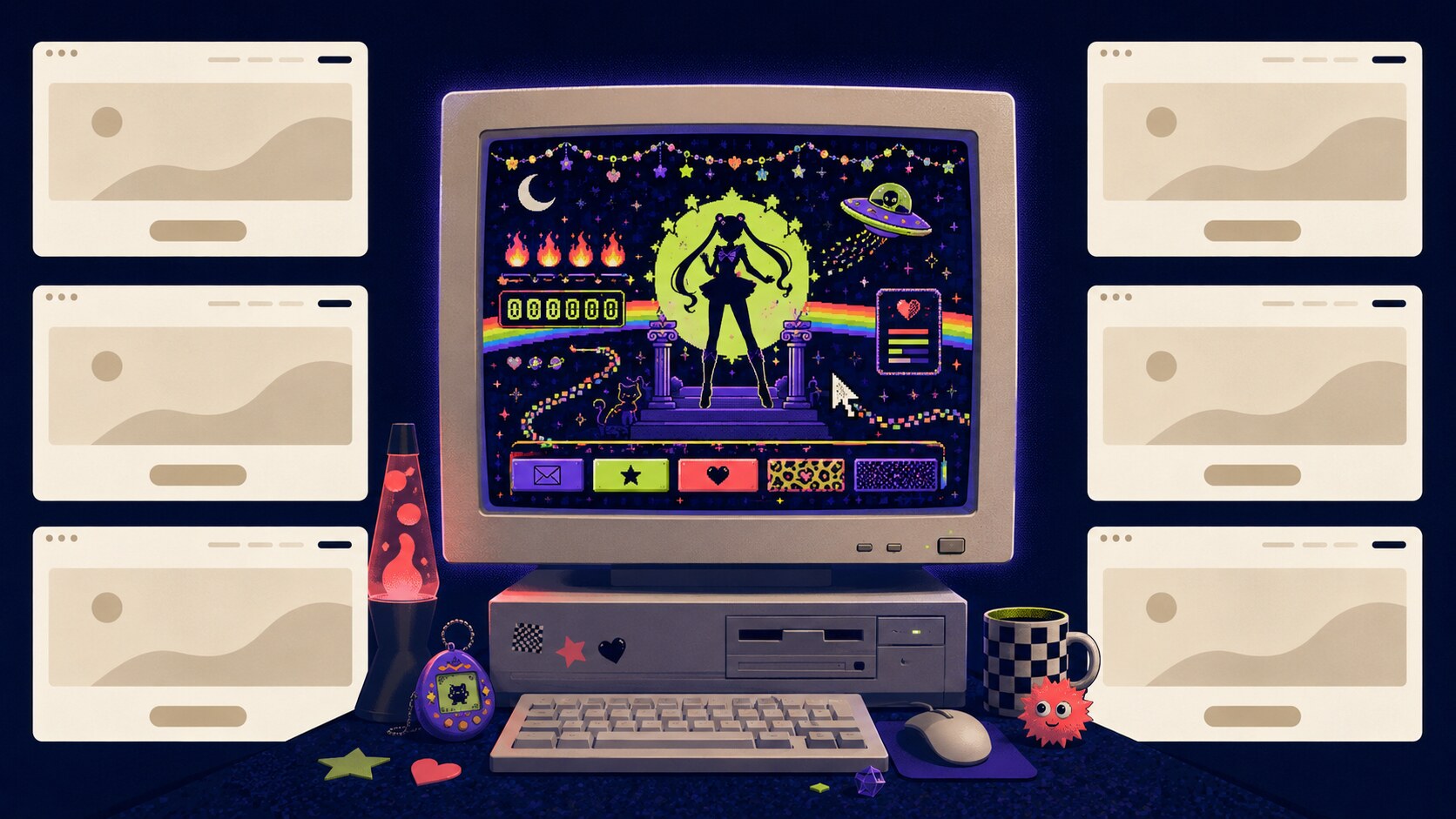
the modern web is dramatically more competent and somehow looks like six websites.
The modern web is dramatically more competent and somehow looks like six websites.
competence became a dress code
this did not happen because designers became boring. designers got very good, browsers became less adversarial, phones turned every layout into a negotiation, and accessibility finally began receiving something closer to the attention it always deserved. a modern site has to work across an absurd range of screens, input methods, network conditions, and human needs. there are good reasons not to construct your navigation from eight unlabeled GIFs of gemstones.
but somewhere between “please let people use the website” and “please make every website a frictionless conversion surface,” competence became a dress code.
templates lowered the barrier to making something functional, which is good. platforms then replaced most of the decisions with defaults, which is convenient. recommendation systems rewarded whatever could be understood immediately, which is efficient. eventually we arrived at a web where enormous numbers of people technically publish all day without ever making a place of their own.
we post inside rooms where the landlord chose the paint, the furniture, the maximum number of characters, and which of our friends are allowed to see us. then the landlord moves the furniture every six months because engagement is down.
the problem is not that every person should learn html and hand-code a shrine to their favorite wrestler. the problem is that the available tools increasingly treat personality as something to pour into a slot after the structure has already been decided.
i do not want the inconvenience back
nostalgia becomes useless the second it starts lying. the old web was not a democratic garden where everybody had equal access and corporations politely stayed outside the gate. hosting cost money. technical knowledge mattered. search was inconsistent. harassment existed. accessibility was often treated as an exotic rumor. plenty of people never got to participate at all.
i do not want to restore the internet from a backup dated 1998. i want the current web—with responsive layouts, readable type, alt text, fast connections, useful standards, and buttons that behave like buttons—to loosen its tie.
keep the competence. bring back the permission.
make a page that exists because you own seventeen pictures of the same cat asleep in different containers. write the definitive case against one episode of a television show that ended twenty years ago. use a color that a brand strategist would describe as “challenging.” add a links page for no reason except that you like those links and would like them to continue existing somewhere.
the weird web never vanished completely. it moved into small blogs, fan wikis, neocities pages, handcrafted portfolios, strange little tools, newsletter archives, and personal domains updated whenever their owners remember the password. you still find pages that feel less like publications and more like being invited into somebody’s bedroom while they explain the complete taxonomy of a thing you had not thought about since 2004.
those pages are not valuable because they are retro. they are valuable because they are specific.
specificity is what the six-websites web keeps sanding off. it cannot be reliably templated because it lives in the unnecessary choices: the odd title, the overlong sidebar, the tiny collection nobody searched for, the joke that makes sense to four readers, and the page made solely because its author woke up furious at commander chakotay.
i would like more of that. not a worse internet. not a slower internet. just an internet where a website can look like somebody got excited and stayed up too late.
i posted that as a joke, but it is also the entire operating theory behind tacobout.online
a personal website should have a name you have to explain. it should contain at least three subjects a growth consultant would beg you to split into separate brands. it should occasionally look like somebody opened a junk drawer and installed an rss feed in it
the vertical is a lie
platforms want a clean answer to “what do you post about?” because clean answers are easier to package. tech account. politics account. reality tv account. music account. gay little pop-culture account. choose a lane, feed the recommendation engine, become legible to the machine
but a person is not a vertical. a person is twenty-seven browser tabs, one of them playing audio from somewhere, three of them technically research, and at least one open because the headline made you mad six hours ago
in the space of two days this site went from Big Brother strategy pathology to an ATProto moderation tool, Geese marketing discourse, krishnacore, and an Avengers multiverse collision. that is not editorial confusion. that is what a brain looks like when nobody has forced it into a content calendar
The camera roll and the personal blog share a basic instinct: save the small, specific thing before the feed swallows it.
the camera roll and the blog are cousins
this flower has been sitting in my IMG library for years. it does not have a discourse attached to it. it does not need a hot take, an affiliate link, or a call to action. i liked it enough to save it
that is still one of the best reasons to put anything on the internet
the camera roll says: this happened in front of me and i wanted another look. the personal blog says: this passed through my head and i wanted somewhere it would not immediately disappear. both are ways of refusing the feed’s insistence that whatever is newest is whatever matters
ownership is not the same thing as audience
Bluesky and Mastodon are better than most platforms at letting posts point outward. rss is still sitting there, unbothered and useful, waiting for everybody to remember it never asked an algorithm for permission. open protocols make it possible to build small, nosy tools when a social platform is missing exactly one fact you want to know
Small tools are personal posts with inputs: a hyperfixation made clickable.
none of that makes the domain a fortress. owning a site does not mean pretending the social web is beneath you; it means having a home to return to after visiting everybody else’s apartments
the feeds are where the conversation happens. the site is where the conversation gets furniture
the weird name is the point
there is no conversion funnel here. no promise that every post will reinforce a niche. the same person can care about open protocols, reality-show social strategy, queer pop culture, old songs, labor, games, movies, and whether the kitchen happens to be clean at the same time the pantry is full
that mess is not a failure to brand the self. it is the self
so yes, the blog is named tacobout.online. god forbid a bitch own a weird little corner of the internet and put a whimsical sign over the door
Dolly Parton and Tim Curry died on the same day at 80. Their careers looked nothing alike, but both made glorious excess… Read more
it is an almost offensively neat piece of cosmic bookkeeping: Dolly Parton and Tim Curry both died on tuesday, august 25, both at 80. the news arrived in separate waves, as if the universe wanted to make sure we had time to feel each floor drop out from under us
on paper, they do not make an obvious pair. Dolly was a mountain songwriter who built a rhinestone republic out of country music, movie stardom, dirty jokes, sharp business instincts, and millions of children’s books. Tim was a Cheshire-born actor whose career ran from the royal court to Rocky Horror, Clue, It, Muppet Treasure Island, and enough voice roles to quietly occupy half our childhoods
but for queer people—and really for anybody who has ever been told to turn the volume down—they spoke two dialects of the same language: too much is not a character flaw
two different dialects of “too much”
Dolly never pretended the hair grew that way. the construction was part of the honesty. she could show you every seam in the image, make the joke before you did, and then land a song so emotionally precise it rearranged the furniture in your chest
the wigs, nails, rhinestones, body jokes, and deliberately impossible silhouette were not camouflage. they were authorship. Dolly understood that artifice can be the route to truth when you are the person choosing it. drag performers recognized that immediately, and Dolly recognized them right back
her allyship was not flawless political branding assembled by committee. it was the same stubborn hospitality that ran through her work and her philanthropy: nobody gets turned away from the family table for being gay, poor, rural, loud, overdressed, undereducated, or otherwise inconvenient. the Human Rights Campaign’s remembrance gets at why that mattered
Tim’s version of permission was less front-porch welcome and more castle door flung open at midnight. Frank-N-Furter was dangerous, selfish, funny, erotic, cruel, magnetic, and gloriously impossible to file into a respectable little box. the performance did not ask permission to blur gender, desire, comedy, horror, and rock music. it simply arrived in heels and took over the room
Camp is not the opposite of sincerity. sometimes it is the lighting rig that lets sincerity survive.
camp was never the opposite of sincerity
this is the part people who distrust camp always miss. exaggeration does not flatten feeling; it can make enough room for feeling to breathe
Dolly’s camp said the wig is fake and the love is not. Tim’s camp said the castle is ridiculous and the desire is real. both used spectacle to smuggle tenderness past people who might have rejected it in plain clothes
neither of them became beloved by sanding off the strange parts. they became beloved because the strange parts were delivered with total craft. Dolly could make a punchline, a feminist workplace anthem, and a devastating farewell song sound like they came from the same honest mouth because they did. Tim could turn a board-game murder mystery, a sewer clown, a cartoon pollutant, and a pirate into distinct species of theatrical delight because he never treated “genre” as an excuse to phone it in
the permission slip remains
celebrity grief is weird. we do not know these people, but we know the rooms their work made inside us. we know which version of ourselves first walked into those rooms and what became possible there
for some people Dolly was proof that poor, rural, feminine, funny, sexual, devout, ambitious, and generous could all inhabit one body without canceling each other out. for some people Tim was the first adult on a screen who made gender trouble look less like a diagnosis and more like a party
The audience leaves; the permission they gave us to be louder, stranger, kinder, and more ourselves does not.
losing both on the same day feels less like a tidy cultural coincidence than somebody dimmed two completely different spotlights at once
the world is not suddenly less queer, less kind, or less gloriously overdecorated. they helped make sure of that. but it is, for the moment, a little less brightly lit
Tim Curry’s “Toxic Love” from FernGully remains an absurdly committed lesson in how destruction sells itself as appetite. Read more
there are villain songs, and then there is Tim Curry spending three and a half minutes making petrochemical extraction sound like the hottest bad decision of your life
FernGully: The Last Rainforest did not need to give pollution a velvet voice, a smoke body, a limber little set of hips, and one of the most committed vocal performances ever smuggled into a children’s movie. it chose excellence anyway
“Toxic Love” works because the movie understands something most environmental messaging is too polite to say: destruction rarely arrives looking like destruction. it arrives selling appetite. it tells you the machine is progress, the poison is convenience, and wanting more is the same thing as being alive
then Tim Curry rolls every syllable around like it owes him rent and turns the whole argument into cabaret. no visible actor, no wink at the camera, just a voice so physical you can practically see the raised eyebrow
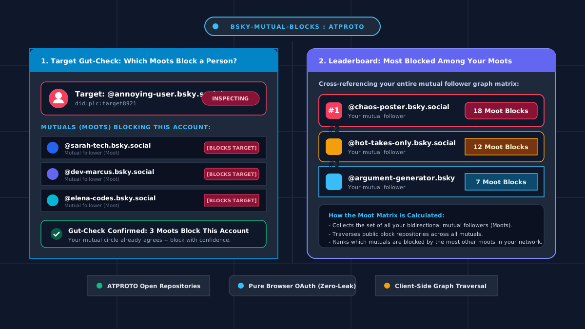
A lightweight, client-side ATProto browser tool for Bluesky that lets you gut-check target accounts against your mutual followers and explore a moot… Read more
There is a very specific gut-check that happens when you come across a chaotic account or bad-faith actor on your timeline. Before hitting the block button, you almost instinctively wonder: is it just me, or have my mutuals already blocked this person?
Naturally, as someone who spends entirely too much time thinking about social graph mechanics and relational data structures, I wanted a clean, reliable way to answer that question. I wanted to see which of my mutual followers (“moots”) are blocking a specific target account—and discover the broader moderation consensus across my network. To make that happen, I built a small tool.
Enter bsky-mutual-blocks: a lightweight, client-side browser app built on Bluesky and ATProto that lets you gut-check target accounts against your mutual follower network and explore a live moot block leaderboard.
bsky-mutual-blocks visualizes which mutual followers block a target account and ranks which moots have the most blocks from other moots.
the beauty of open protocols (and why this works)
On traditional siloed platforms, analyzing moderation consensus across your social circle is essentially impossible. Data is locked behind proprietary servers, rate limits are punitive, and moderation actions are treated like state secrets.
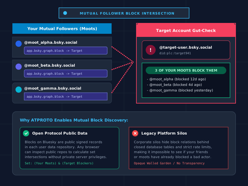
Bluesky and the AT Protocol completely change the paradigm. Because user repositories on ATProto are publicly discoverable collections of structured, signed data—including app.bsky.graph.block and follow records—you don’t need privileged backend access to inspect public network topology.
When you want to gut-check a target account, the client identifies your mutual followers (bidirectional follows) and crawls their public block records. If multiple people in your trusted circle have already created signed block records pointing at that target’s DID, that overlap is revealed through transparent, client-side set intersection.
Public signed records in ATProto repositories allow client-side set intersection to reveal which mutuals block a given account.
how it’s built & what it actually does
I designed the app to be fast, privacy-preserving, zero-maintenance, and centered around two primary workflows:
1. target gut-check
Search any Bluesky handle or DID to see which of your mutual followers are currently blocking that account. It provides instant context before you block, follow, or reply, allowing you to leverage the collective moderation wisdom of your trusted network.
2. moot block leaderboard
Beyond individual lookups, the client can analyze your entire mutual graph to calculate which accounts hold the highest block counts across your moots, ranking network-wide block consensus in real-time.
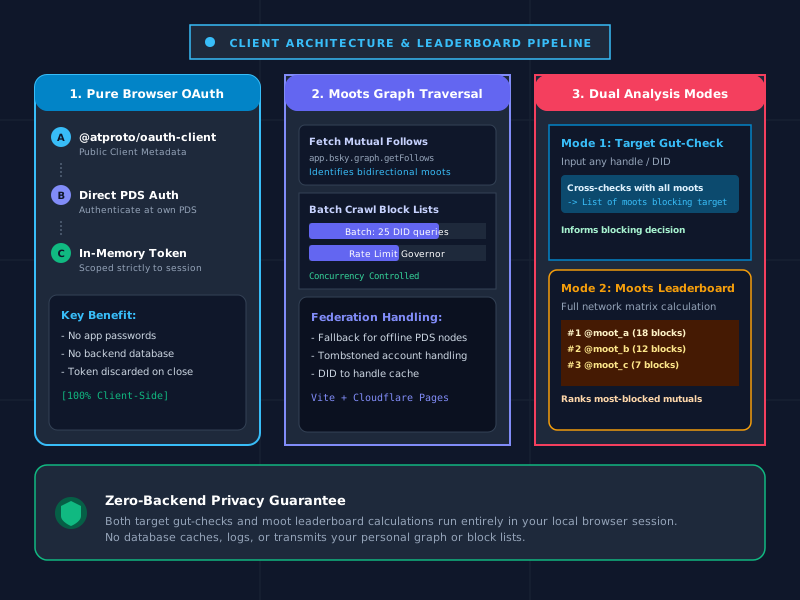
Nobody should have to hand over app passwords or account credentials to third-party tools. Using ATProto’s official browser OAuth flow with public client metadata, authentication happens directly against your own PDS (Personal Data Server). The session token lives solely in your browser memory and is discarded when you disconnect.
Vite + Cloudflare Pages architecture
The entire project is built with TypeScript and bundled with Vite, deployed as a static application on Cloudflare Pages (wrangler.jsonc). There is no backend server, no intermediary proxy, and no central database storing your social connections.
Client-side architecture of bsky-mutual-blocks illustrating pure browser OAuth, batched block crawling, and the dual analysis pipeline.
key technical takeaways
PDS Federation & DID Resolution: Translating user handles into persistent DIDs (via plc.directory or HTTPS DNS) and querying decentralized repositories requires robust fallback handling for custom domains, federated PDS hosts, and deleted accounts.
Concurrent Batching & Rate Limits: Traversing block records across dozens or hundreds of mutual followers sequentially in the browser would quickly trigger AppView rate limits. Chunking requests into controlled concurrent batches keeps traversal fast while avoiding 429 throttling.
Client-Side Privacy by Default: Because all graph traversal and set comparisons execute locally in the user’s browser, there is zero risk of logging, tracking, or leaking who you search or who your mutuals block.
wrap-up
Building on ATProto highlights what makes open social protocols exciting: open schemas, verifiable user data, and the ability to build lightweight, single-purpose tools that empower users to understand their network dynamics on their own terms.
Catching up on Big Brother 28 after a theme CPU glitch: calling out the house micro-aggressions, Angela’s M&M dye art, Drew’s veto… Read more
so, if you noticed the tumbleweeds rolling through here over the last month and change, no, i didn’t abandon ship—my theme decided to start chewing through cpu cycles like it had a personal vendetta against my server. but we are back online just in time for the absolute circus currently unfolding inside the Big Brother 28 house.
when i last posted on july 17th, we were in the golden era of absurdity: eggela had officially hatched, the tool shed was consolidating power with the smug certainty of people who think day 10 alliances last until finale night, and we were all just trying to figure out how many tools could fit in one metaphorical shed before the roof collapsed. fast forward six weeks, and the vibes in the house have shifted from goofy summer camp chaos to messy, uncomfortable, and deeply fractured warfare.
angela’s m&m dye art and the lingering tool shed hangover
first, we have to talk about the sheer unhinged brilliance of angela painting with water mixed with m&m dye using what appeared to be a makeup brush. total, unadulterated icon behavior. say what you want about her game, but the chaotic diy innovation is why we watch feeds. meanwhile, the lingering smugness from the early vet alliance—especially dee and devens acting like they held a monopoly on common sense—has steadily soured into pure paranoia. dee gets so bored in that house that i genuinely think she’s going to figure out a way to blindside herself before jury even hits. whoever wins the next hoh needs to be pissed enough at her to quote janelle verbatim.
Barrett was at a cross-roads this week.
the subtle micro-aggressions and uncomfortable house dynamics
as entertaining as the gameplay pivots can be, we also need to call out the darker undertones that have crept into the house dynamics over the past few weeks. it’s become exhausting watching the subtle micro-aggressions, coded dismissiveness, and casual othering that keep cropping up on the feeds. whenever someone outside the dominant clique tries to assert themselves or play the game, they’re met with immediate tone policing, exaggerated claims of feeling “threatened” or “uncomfortable,” and double standards that never apply to the majority alliance.
it’s that classic Big Brother social pathology where isolating someone socially gets justified as “pure game,” while the actual rhetoric used in private conversations crosses the line into micro-invalidations and passive-aggressive hostility. the lack of self-awareness from players who preach good vibes while actively marginalizing others is infuriating to watch on the live feeds. recognizing implicit bias and checking your own behavior shouldn’t stop at the front door of the studio lot.
drew blowing up the house, thog’s sudden galaxy brain, and the bbbb nightmare
on the game front, drew went and detonated everything at the veto ceremony, leaving us with a blockbuster nomination lineup that has everyone losing their minds. the fact that drew got distracted (classic) and ended up on the block next to mal and taylor is peak bb28. and watching mallory try to convince drew to throw the block buster was almost impressive in how overtly cruel it was—like, wouldn’t him throwing his own game prove he actually wants you to stay?? mal is stressing out on wednesday over thoughts meant for friday, spiraling into total green dinosaur screaming territory.
Dee stands behind Barrett menacingly in the BB28 pantry.
and then there’s thog (haley). i spent the first month convinced she could truly do no right in my eyes, but suddenly she’s out here exhibiting actual tactical perception? her read on barrett’s pitch—noticing that if they only approach her as the swing for one specific scenario, they already have the others locked down—was legitimately sharp. not thog having the best read in the room?!
gameplay philosophy: talk to people, clean the damn kitchen
as we head into the live eviction, the bbbb scenarios are pure chaos. if mal wins, fap has to publicly pick “not drew,” firming up the house lines. if taylor wins, fap picks mal, drew walks, and sides lock in. if drew wins, we get a messy vote where mal goes and yash is forced to pivot again (which he will). usually i root for the specific outcome that causes maximum drama, but this week every single path leads to a different brand of mess.
my only real gripes right now? first, production giving us zero hints about the incoming twist in the promo email (terrified of what nonsense they’re about to drop on us). second, everyone spending all day hyperventilating about being lied to in a game built entirely around lying—stop agonizing and go talk to people! and finally, the state of that house. people are doing dirty stuff on food prep surfaces again. forget physical comps; the next blockbuster should literally just be a timed dishwashing challenge.