
I spent years believing that imposter syndrome was a sophisticated personal affliction. You treat it like a delicate psychological tax on ambition: you read books about quiet confidence, you practice pausing before answering questions in meetings, and you spend twenty minutes drafting a three-sentence email because you are convinced that using the wrong preposition will reveal to the entire department that you have been faking your career since 2018.
Imposter syndrome relies entirely on a foundational assumption of general competence. For you to feel like a fraud, you have to believe that the room is full of people who are not frauds. You have to picture the other participants as people who received the secret memo, mastered the enterprise software without consulting YouTube tutorials, and earned their chairs through rigorous intellectual superiority.
Then, yesterday, the new White House press secretary walked up to the podium for her debut briefing.
It was not merely a rough day at work. It was an interpretive dance of institutional malfunction. Dubbed the “Zachbot” across social media within roughly eighteen minutes of taking the lectern, Katie Zacharia stood before the White House press corps with a massive three-ring binder, visibly short-circuited on basic procedural questions, and radiated the specific, unmistakable panic of an eighth-grader giving an oral book report on a novel they only read the jacket copy for during homeroom.
Watching it in real time was deeply, spiritually restorative.
the competence myth requires someone to have done the reading
There is a moment in every high-stress job where you freeze. Your pulse spikes, your throat gets dry, and your brain offers up the helpful suggestion that you should perhaps fake your own death and move to an unincorporated township in Idaho. That fear is driven by the belief that high-stakes environments demand flawless, encyclopedic mastery.
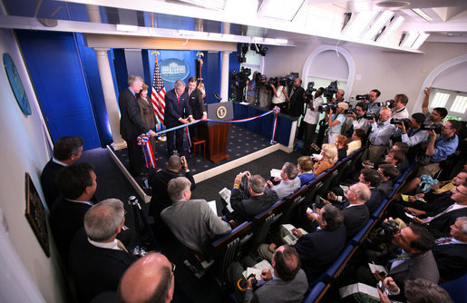
The White House press briefing is supposed to be the apex predator of high-stakes environments. It is a small theater in the West Wing designed entirely to project imperial authority. You have the blue backdrop, the Great Seal, forty hardened political reporters whose mortgage payments depend on catching you in a contradiction, and a bank of cameras beaming your pores to foreign embassies in twenty-four time zones.

If competence were the baseline barrier to entry for holding that microphone, no human being would ever take the job without six advanced degrees, a photographic memory, and a nervous system made of tempered steel.
Instead, we watched a woman who is theoretically the voice of the executive branch of a nuclear superpower flip through a binder like someone frantically looking for a dry cleaner receipt at the bottom of a tote bag. She dodged softballs, stared blankly at straightforward follow-ups, and treated the entire briefing like a hostage negotiation between her notes and her vocal cords.
It was glorious. It was the single most liberating piece of workplace therapy available without a co-pay.
authority is mostly just not leaving the room
The dirty secret of institutional authority is that confidence is almost never downstream of competence. It is downstream of access.
The people who run things—the people who sign off on company-wide reorgs, approve enterprise software migrations that ruin everybody’s Thursday, and represent national governments on cable news—are rarely the people who stayed up until 2 a.m. making sure the spreadsheet was formatted correctly. They are simply the people who did not flinch when someone handed them a lanyard.
Half of growing up is realizing that the “adults in the room” do not exist. There is no shadowy council of experts reviewing your work against a grand master rubric. There are only people who walked through a door, realized nobody was checking badges with any real enthusiasm, and decided to keep standing near the water cooler.

When you struggle with imposter syndrome, you constantly audit yourself against an impossible standard that nobody in power is actually meeting. You worry that you don’t know enough about the budget forecast to speak during the Q3 planning call, while the person chairing the meeting is currently trying to remember whether Q3 comes before or after July.
go ahead and send the email
I am not suggesting that preparation is useless or that doing your job well is a sucker’s game. Excellence is great. Knowing what you’re talking about is a polite courtesy to everyone who has to listen to you.
I am suggesting that you lower the emotional stakes of your daily existence.
If someone can walk into the James S. Brady Press Briefing Room, face fifty hostile journalists, stumble through fifteen minutes of pre-scripted evasion without reading the room, and still collect a federal paycheck on Friday, you are entirely qualified to unmute yourself on Zoom. You can pitch the project. You can apply for the job even if you only meet six of the eight arbitrary bullet points on the listing. You can send the email without asking three trusted friends to proofread the greeting.
The bar is not hovering in the upper stratosphere. The bar is lying flat on the linoleum, and somebody just tripped over it on live television.
Pick up your binder. You’re going to do fine.
Featured image: The James S. Brady Press Briefing Room. Photo: White House / Wikimedia Commons.